More exploratory plots with ggplot2 and purrr: Adding conditional elements
This summer I was asked to collaborate on an analysis project with many response variables. As usual, I planned on automating my initial graphical data exploration through the use of functions and purrr::map() as I’ve written about previously.
However, this particular project was a follow-up to a previous analysis. In the original analysis, different variables were analyzed on different scales. I wanted to put the new plots on whatever scale they were analyzed in that analysis. If I was going to automate the plotting, which I definitely wanted to do with so many variables 😄, I needed to add conditional elements.
This post demonstrates how I used if() statements within my plotting function to use different plotting elements depending on which variable I was plotting.
Table of Contents
R packages
I will use ggplot2 for plotting and purrr for looping through variables.
library(ggplot2) # v. 3.2.1
library(purrr) # v. 0.3.2
The data
My simplified example dataset, dat, contains three response variables, cov_plant, cov_oth, and gap. I created two categorical explanatory variables, year with 3 levels and trt with two levels.
dat = structure(list(cov_plant = c(3.7, 1.8, 7.5, 0.4, 7.9, 1.2, 0.7,
2.3, 6.9, 4.1, 17.7, 2.4, 0.9, 14.3, 4.9, 0, 4.1, 3.6, 1.1, 7.7,
0, 1.5, 1.7, 11.5, 0.8, 12.3, 7.1, 6.9, 5.6, 2.7, 1, 2.5, 2,
0.7, 0.7, 2.9, 4, 2.5, 2.9, 1.5, 0.5, 22.8, 2.8, 1.4, 1, 2.9,
2.4, 4.1, 4.1, 1.9, 2.8, 5, 5.7, 5.6, 0, 4.6, 8.1, 0.5, 88.9,
1), cov_oth = c(11.5, 63.2, 34, 65.5, 28.8, 8.6, 7.1, 65.5, 12.1,
3, 23.6, 3.8, 24.9, 55.9, 24.2, 78.2, 81.1, 10.7, 30.7, 23.5,
10.1, 4.6, 45.7, 37.6, 81.3, 39.1, 50.8, 75.8, 78.2, 23.9, 53,
51.1, 2.5, 40.2, 15.9, 91.3, 44, 72.9, 82.7, 42.4, 94.1, 23,
86.2, 50.1, 88.9, 80.5, 34.2, 68.7, 45, 13.9, 44.2, 85, 79.6,
1, 45.3, 69.5, 89.6, 22.2, 1.3, 88), gap = c(2.8, 11.8, 0.3,
17.2, 18.3, 1.4, 19.6, 19.4, 2.6, 66.3, 97.1, 17, 381.5, 15.7,
8.3, 2.4, 3.8, 3.8, 246.6, 43.2, 16.7, 6.6, 3.1, 2.4, 3.2, 4.3,
0.3, 2.1, 41.7, 68.9, 5.1, 5.7, 0.4, 35.5, 1.1, 10.8, 5, 11.8,
75.5, 5.4, 12.6, 5.2, 11.4, 6.8, 5.3, 1.1, 3.2, 2.9, 5.2, 0.2,
1.5, 0.6, 7.4, 18.6, 11.7, 1.6, 13.7, 7.1, 19.9, 16.8), year = structure(c(1L,
1L, 1L, 1L, 1L, 1L, 1L, 1L, 1L, 1L, 1L, 1L, 1L, 1L, 1L, 1L, 1L,
1L, 1L, 1L, 2L, 2L, 2L, 2L, 2L, 2L, 2L, 2L, 2L, 2L, 2L, 2L, 2L,
2L, 2L, 2L, 2L, 2L, 2L, 2L, 3L, 3L, 3L, 3L, 3L, 3L, 3L, 3L, 3L,
3L, 3L, 3L, 3L, 3L, 3L, 3L, 3L, 3L, 3L, 3L), .Label = c("Year 1",
"Year 2", "Year 3"), class = "factor"), trt = structure(c(1L,
1L, 1L, 1L, 1L, 1L, 1L, 1L, 1L, 1L, 2L, 2L, 2L, 2L, 2L, 2L, 2L,
2L, 2L, 2L, 1L, 1L, 1L, 1L, 1L, 1L, 1L, 1L, 1L, 1L, 2L, 2L, 2L,
2L, 2L, 2L, 2L, 2L, 2L, 2L, 1L, 1L, 1L, 1L, 1L, 1L, 1L, 1L, 1L,
1L, 2L, 2L, 2L, 2L, 2L, 2L, 2L, 2L, 2L, 2L), .Label = c("a",
"b"), class = "factor")), row.names = c(NA, -60L), class = "data.frame")
Here are the first six rows of this dataset.
head(dat)# cov_plant cov_oth gap year trt
# 1 3.7 11.5 2.8 Year 1 a
# 2 1.8 63.2 11.8 Year 1 a
# 3 7.5 34.0 0.3 Year 1 a
# 4 0.4 65.5 17.2 Year 1 a
# 5 7.9 28.8 18.3 Year 1 a
# 6 1.2 8.6 1.4 Year 1 aI spent a fair amount of time sleuthing out which variables were used and which transformations were done in the original analysis. It turned out many (but not all) of the variables in that analysis were log transformed. Variables that contained 0 values were shifted by a fixed constant prior to the log transformation. A different constant was used for different variables.
I made a dataset of variable metadata to help me keep all this information organized. This dataset contains a row for each variable along with a description of what that variable was, the units the variable was measured in, the transformation used for analysis, and the constant used to shift the variable. I’ll call this dataset resp_dat.
This metadata dataset was key in adding conditional elements to my plotting function.
resp_dat = structure(list(variable = structure(c(2L, 1L, 3L), .Label = c("cov_oth",
"cov_plant", "gap"), class = "factor"), description = structure(3:1, .Label = c("Gap size",
"Other cover", "Plant cover"), class = "factor"), units = structure(c(1L,
1L, 2L), .Label = c("%", "m"), class = "factor"), transformation = structure(c(2L,
1L, 2L), .Label = c("identity", "log"), class = "factor"), constant = c(0.3,
0, 0)), class = "data.frame", row.names = c(NA, -3L))

resp_dat
# variable description units transformation constant
# 1 cov_plant Plant cover % log 0.3
# 2 cov_oth Other cover % identity 0.0
# 3 gap Gap size m log 0.0Initial plotting function
I set up my initial plotting function to make a scatterplot of the raw data per year for each trt. Different trt were indicated by shapes and colors, and I added group means as larger symbols connected by lines.
You can see that my plotting code ended up fairly complicated. I’m skipping the (many!) steps it took to get to this point. While I don’t show the process here, you can rest assured that I did a lot of testing to work out the plot structure prior to making the plotting function below. 😉
In addition to the plotting code, my plot_fun() function includes a line where I subset the resp_dat dataset to only the row of metadata for the response variable used in the plot. I use this information to add the constant to y and make a plot title with a description of the variable plus the units.
plot_fun = function(data = dat, respdata = resp_dat, response) {

     respvar = subset(respdata, variable == response)

     ggplot(data = data, aes(x = year,
                             y = .data[[response]] + respvar$constant,
                             shape = trt,
                             color = trt,
                             group = trt) ) +
          geom_point(position = position_dodge(width = 0.5),
                   alpha = 0.25,
                   size = 2, show.legend = FALSE) +
          stat_summary(fun.y = mean, geom = "point",
                       position = position_dodge(width = 0.5),
                       size = 4, show.legend = FALSE) +
          stat_summary(fun.y = mean, geom = "line",
                       position = position_dodge(width = 0.5),
                       size = 1, key_glyph = "rect") +
          theme_bw(base_size = 14) +
          theme(legend.position = "bottom",
                legend.direction = "horizontal",
                legend.box.spacing = unit(0, "cm"),
                legend.text = element_text(margin = margin(l = -.2, unit = "cm") ),
                panel.grid.minor.y = element_blank() ) +
          scale_color_grey(name = "",
                           label = c("A Treatment", "B Treatment"),
                           start = 0, end = 0.5) +
          labs(x = "Year since treatment",
               title = paste0(respvar$descrip, " (", respvar$units, ")"),
               y = NULL)
}
Here is what the plot looks like for cov_plant.
plot_fun(response = "cov_plant")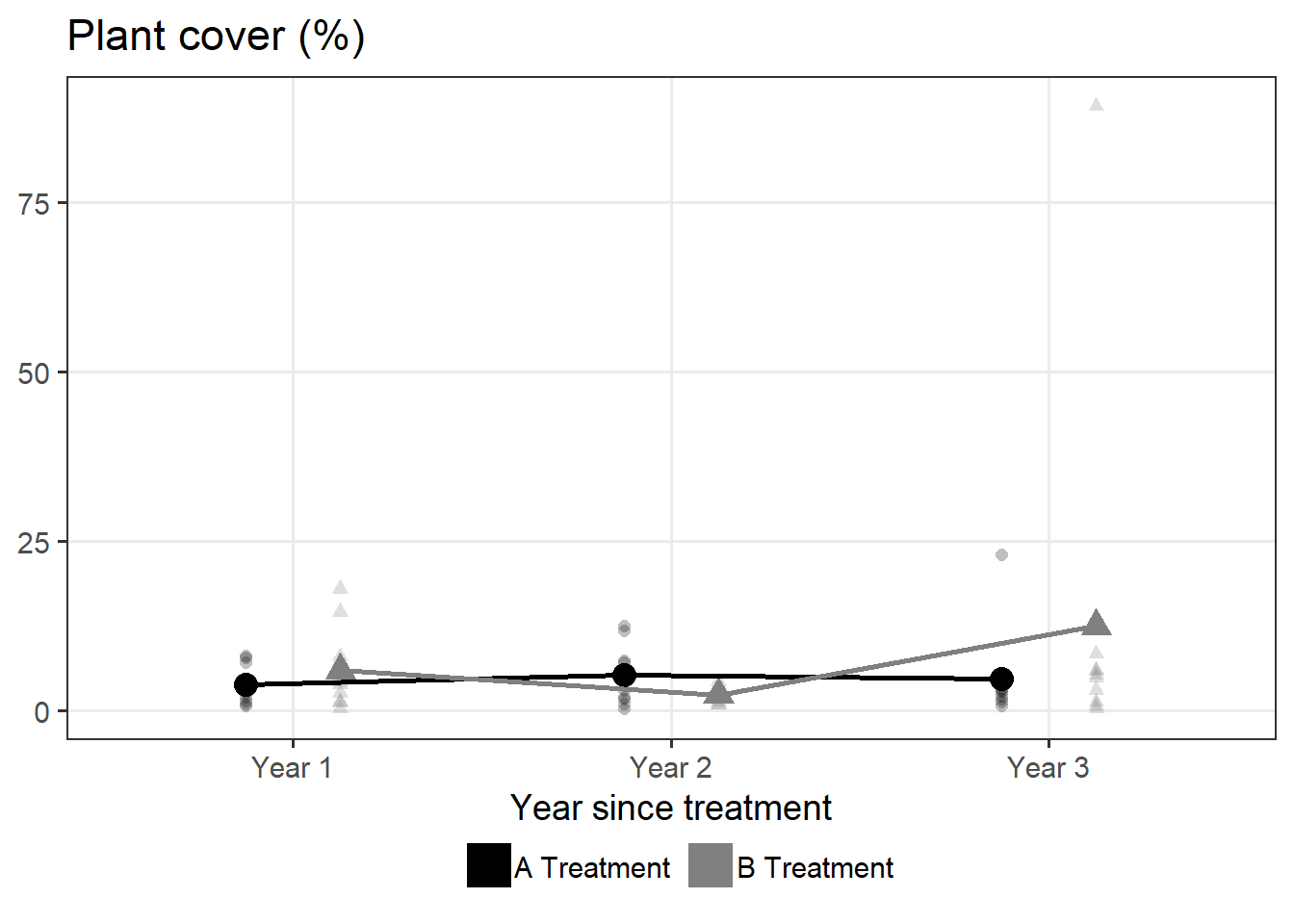
Adding a conditional axis scale
I wanted to put variables that were log transformed in the original analysis on the log scale. Since not all variables were transformed, I wanted to use scale_y_log10() for log transformed variables and the standard scale for everything else.
To achieve this, I will assign my base plot a name within the function so I can add on to it conditionally. I name it g1.
I use the transformation column in the variable metadata to check if a log transformation was done or not via grepl(). If it was done, I add scale_y_log10() to the existing plot. Otherwise I return the plot on the original scale.
This is what that code looks like that I’ll add to the end of my function.
if( grepl("log", respvar$transformation) ) {
          g1 + scale_y_log10()
     } else {
          g1
     }
I used the metadata I created to use in the if() statement, but you could do something similar if you had variables with the transformation as part of the variable name.
Here is what the plotting function looks like now.
plot_fun2 = function(data = dat, respdata = resp_dat, response) {

     respvar = subset(respdata, variable == response)

     g1 = ggplot(data = data, aes(x = year,
                                  y = .data[[response]] + respvar$constant,
                                  shape = trt,
                                  color = trt,
                                  group = trt) ) +
          geom_point(position = position_dodge(width = 0.5),
                     alpha = 0.25,
                     size = 2, show.legend = FALSE) +
          stat_summary(fun.y = mean, geom = "point",
                       position = position_dodge(width = 0.5),
                       size = 4, show.legend = FALSE) +
          stat_summary(fun.y = mean, geom = "line",
                       position = position_dodge(width = 0.5),
                       size = 1, key_glyph = "rect") +
          theme_bw(base_size = 14) +
          theme(legend.position = "bottom",
                legend.direction = "horizontal",
                legend.box.spacing = unit(0, "cm"),
                legend.text = element_text(margin = margin(l = -.2, unit = "cm") ),
                panel.grid.minor.y = element_blank() ) +
          scale_color_grey(name = "",
                           label = c("A Treatment", "B Treatment"),
                           start = 0, end = 0.5) +
          labs(x = "Year since treatment",
               title = paste0(respvar$descrip, " (", respvar$units, ")"),
               y = NULL)

     if( grepl("log", respvar$transformation) ) {
          g1 + scale_y_log10()
     } else {
          g1
     }
}
Now when I use the function on a log transformed variable like cov_plant, the y axis is on the log scale.
plot_fun2(response = "cov_plant")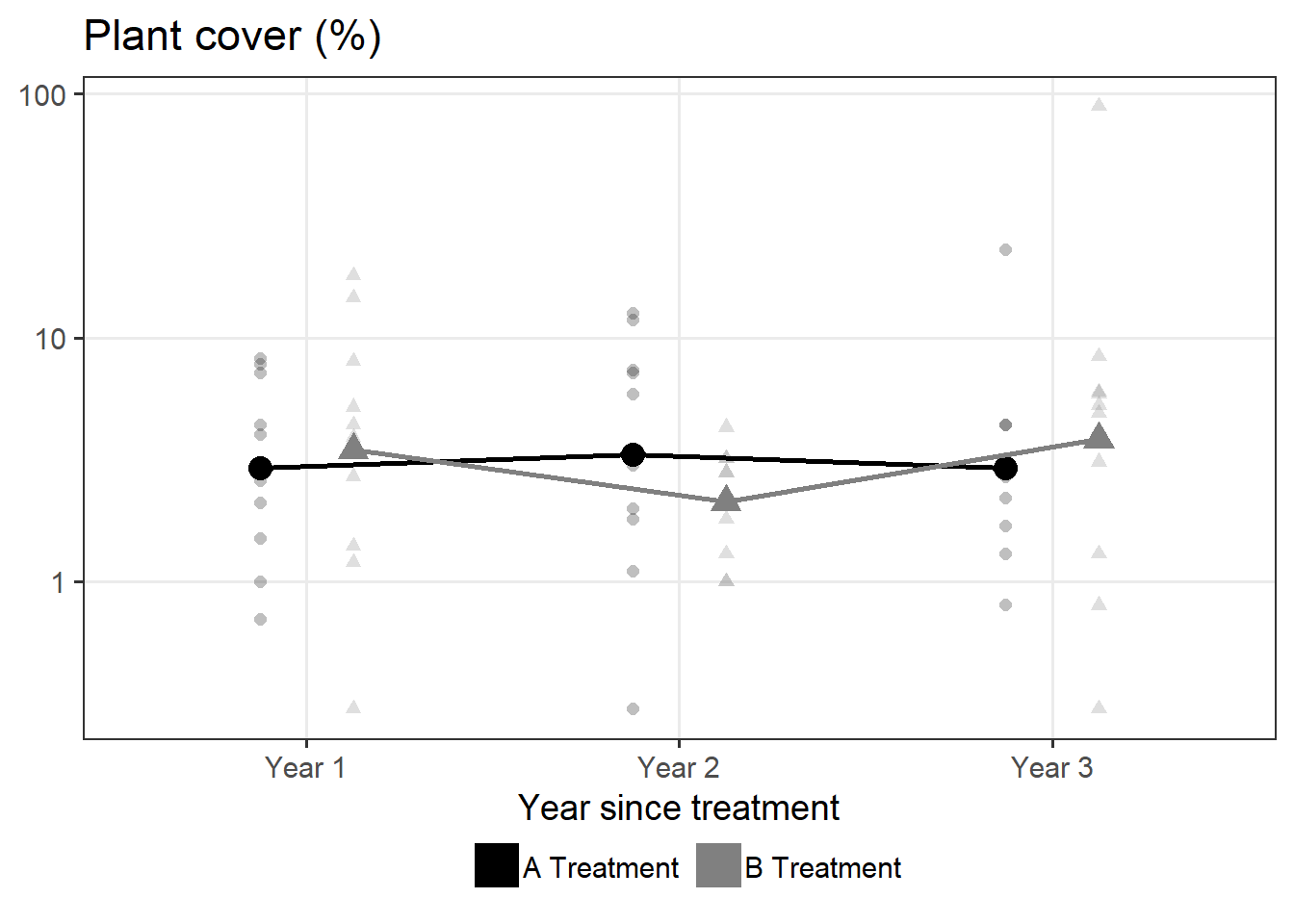
But the y axis for cov_oth, which was analyzed on the original scale, is not.
plot_fun2(response = "cov_oth")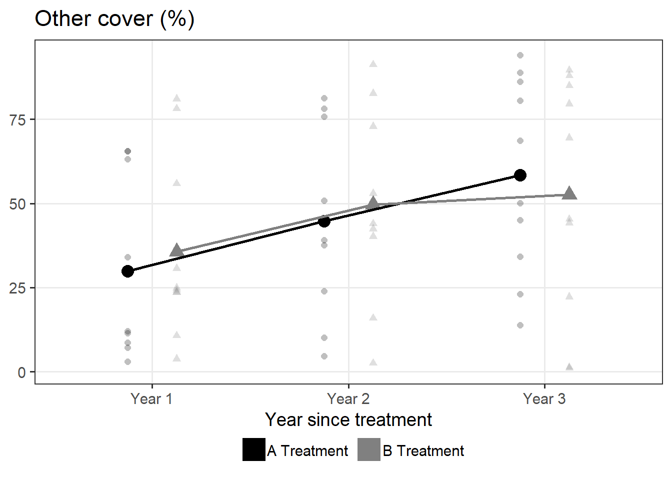
Adding a conditional caption
After I changed the y axis scale for some variables, I decided I should make sure that the scale of the axis is clear to the reader. In addition, I wanted to highlight the fact that some variables were shifted prior to transformation. I decided to create a conditional caption with this information, which can then be then added to the plot in labs().
Since I ended up with three conditions, log transformation, log transformation with added constant, or no transformation, I ended up using if()-else if()-else to do this.
caption_text = {
     if(respvar$constant != 0 ) {
               paste0("Y axis on log scale ",
                      "(added constant ",
                      respvar$constant, ")")
          } else if(!grepl("log", respvar$transformation) ) {
               "Y axis on original scale"
          } else {
               "Y axis on log scale"
          }
}
The function is getting pretty long and complicated now.
plot_fun3 = function(data = dat, respdata = resp_dat, response) {

     respvar = subset(respdata, variable == response)

     caption_text = {
          if(respvar$constant != 0 ) {
               paste0("Y axis on log scale ",
                      "(added constant ",
                      respvar$constant, ")")
        } else if(!grepl("log", respvar$transformation) ) {
                "Y axis on original scale"
        } else {
                "Y axis on log scale"
        }
     }

     g1 = ggplot(data = data, aes(x = year,
                                  y = .data[[response]] + respvar$constant,
                                  shape = trt,
                                  color = trt,
                                  group = trt) ) +
          geom_point(position = position_dodge(width = 0.5),
                     alpha = 0.25,
                     size = 2, show.legend = FALSE) +
          stat_summary(fun.y = mean, geom = "point",
                       position = position_dodge(width = 0.5),
                       size = 4, show.legend = FALSE) +
          stat_summary(fun.y = mean, geom = "line",
                       position = position_dodge(width = 0.5),
                       size = 1, key_glyph = "rect") +
          theme_bw(base_size = 14) +
          theme(legend.position = "bottom",
                legend.direction = "horizontal",
                legend.box.spacing = unit(0, "cm"),
                legend.text = element_text(margin = margin(l = -.2, unit = "cm") ),
                panel.grid.minor.y = element_blank() ) +
          scale_color_grey(name = "",
                           label = c("A Treatment", "B Treatment"),
                           start = 0, end = 0.5) +
          labs(x = "Year since treatment",
               title = paste0(respvar$descrip, " (", respvar$units, ")"),
               y = NULL,
               caption = caption_text)

     if( grepl("log", respvar$transformation) ) {
          g1 +
               scale_y_log10()
     } else {
          g1
     }
}
But it does what I want. The plots now have captions with information added at the bottom in addition to the conditional y axis scale.
plot_fun3(response = "cov_plant")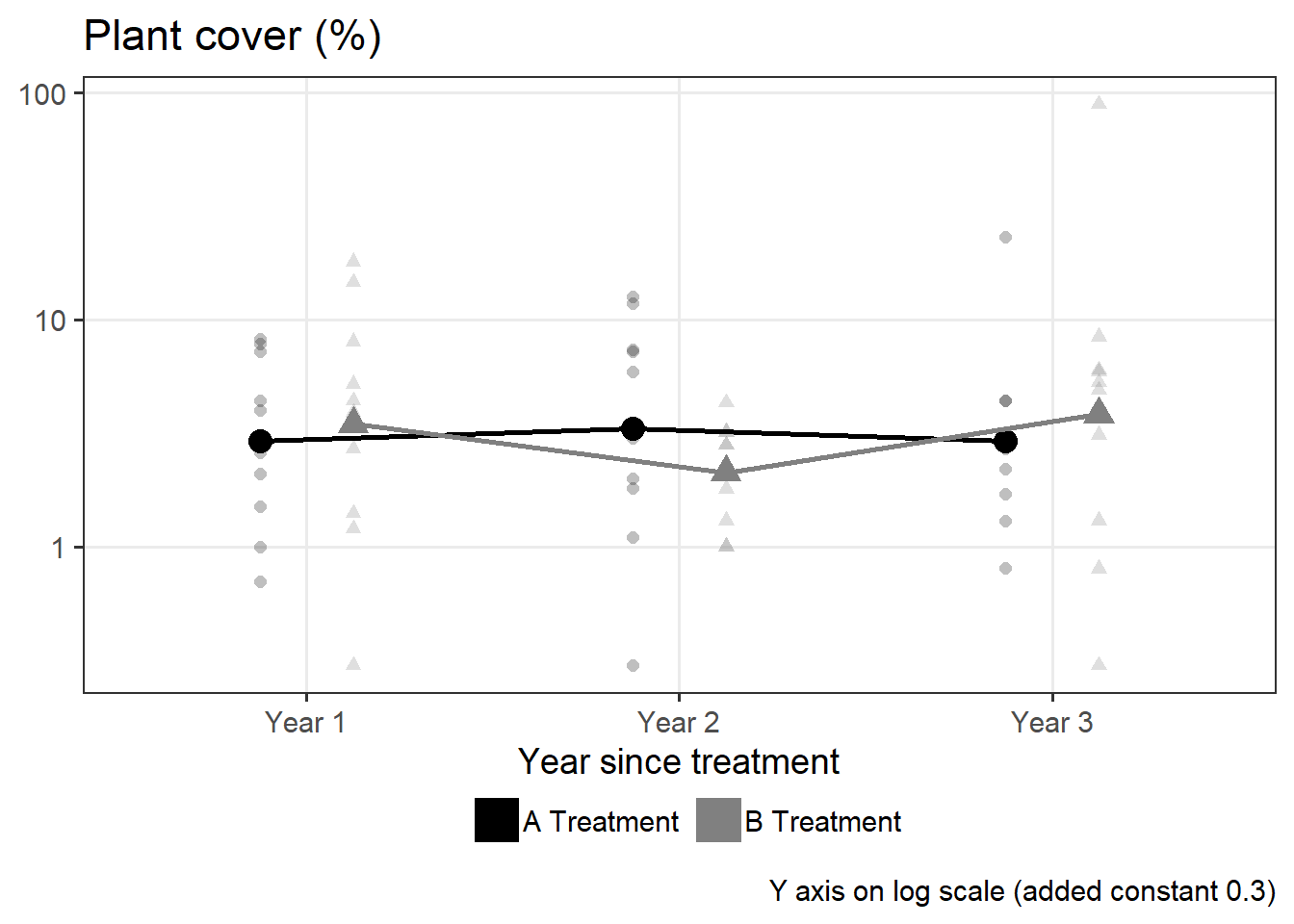
Looping through the variables
Once I have worked out the details of the function I can loop through all the variables and make plots with purrr::map(). I’ve set this up to loop through the vector of variable names, stored in vars as strings.
vars = names(dat)[1:3]
vars
# [1] "cov_plant" "cov_oth" "gap"all_plots = map(vars, ~plot_fun3(response = .x) )Here are the plots, with captions showing that two plots are on the log scale, one is on the original scale, and one has an added constant.
I’m showing the plots all together here, but I actually saved them in a PDF with one plot per page so collaborators could easily page through them.
cowplot::plot_grid(plotlist = all_plots)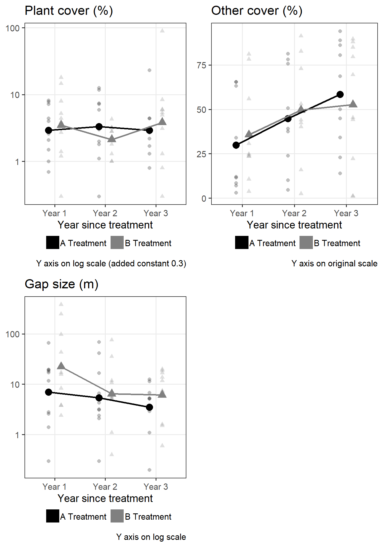
Just the code, please
Here’s the code without all the discussion. Copy and paste the code below or you can download an R script of uncommented code from here.
library(ggplot2) # v. 3.2.1
library(purrr) # v. 0.3.2
dat = structure(list(cov_plant = c(3.7, 1.8, 7.5, 0.4, 7.9, 1.2, 0.7,
2.3, 6.9, 4.1, 17.7, 2.4, 0.9, 14.3, 4.9, 0, 4.1, 3.6, 1.1, 7.7,
0, 1.5, 1.7, 11.5, 0.8, 12.3, 7.1, 6.9, 5.6, 2.7, 1, 2.5, 2,
0.7, 0.7, 2.9, 4, 2.5, 2.9, 1.5, 0.5, 22.8, 2.8, 1.4, 1, 2.9,
2.4, 4.1, 4.1, 1.9, 2.8, 5, 5.7, 5.6, 0, 4.6, 8.1, 0.5, 88.9,
1), cov_oth = c(11.5, 63.2, 34, 65.5, 28.8, 8.6, 7.1, 65.5, 12.1,
3, 23.6, 3.8, 24.9, 55.9, 24.2, 78.2, 81.1, 10.7, 30.7, 23.5,
10.1, 4.6, 45.7, 37.6, 81.3, 39.1, 50.8, 75.8, 78.2, 23.9, 53,
51.1, 2.5, 40.2, 15.9, 91.3, 44, 72.9, 82.7, 42.4, 94.1, 23,
86.2, 50.1, 88.9, 80.5, 34.2, 68.7, 45, 13.9, 44.2, 85, 79.6,
1, 45.3, 69.5, 89.6, 22.2, 1.3, 88), gap = c(2.8, 11.8, 0.3,
17.2, 18.3, 1.4, 19.6, 19.4, 2.6, 66.3, 97.1, 17, 381.5, 15.7,
8.3, 2.4, 3.8, 3.8, 246.6, 43.2, 16.7, 6.6, 3.1, 2.4, 3.2, 4.3,
0.3, 2.1, 41.7, 68.9, 5.1, 5.7, 0.4, 35.5, 1.1, 10.8, 5, 11.8,
75.5, 5.4, 12.6, 5.2, 11.4, 6.8, 5.3, 1.1, 3.2, 2.9, 5.2, 0.2,
1.5, 0.6, 7.4, 18.6, 11.7, 1.6, 13.7, 7.1, 19.9, 16.8), year = structure(c(1L,
1L, 1L, 1L, 1L, 1L, 1L, 1L, 1L, 1L, 1L, 1L, 1L, 1L, 1L, 1L, 1L,
1L, 1L, 1L, 2L, 2L, 2L, 2L, 2L, 2L, 2L, 2L, 2L, 2L, 2L, 2L, 2L,
2L, 2L, 2L, 2L, 2L, 2L, 2L, 3L, 3L, 3L, 3L, 3L, 3L, 3L, 3L, 3L,
3L, 3L, 3L, 3L, 3L, 3L, 3L, 3L, 3L, 3L, 3L), .Label = c("Year 1",
"Year 2", "Year 3"), class = "factor"), trt = structure(c(1L,
1L, 1L, 1L, 1L, 1L, 1L, 1L, 1L, 1L, 2L, 2L, 2L, 2L, 2L, 2L, 2L,
2L, 2L, 2L, 1L, 1L, 1L, 1L, 1L, 1L, 1L, 1L, 1L, 1L, 2L, 2L, 2L,
2L, 2L, 2L, 2L, 2L, 2L, 2L, 1L, 1L, 1L, 1L, 1L, 1L, 1L, 1L, 1L,
1L, 2L, 2L, 2L, 2L, 2L, 2L, 2L, 2L, 2L, 2L), .Label = c("a",
"b"), class = "factor")), row.names = c(NA, -60L), class = "data.frame")
head(dat)

resp_dat = structure(list(variable = structure(c(2L, 1L, 3L), .Label = c("cov_oth",
"cov_plant", "gap"), class = "factor"), description = structure(3:1, .Label = c("Gap size",
"Other cover", "Plant cover"), class = "factor"), units = structure(c(1L,
1L, 2L), .Label = c("%", "m"), class = "factor"), transformation = structure(c(2L,
1L, 2L), .Label = c("identity", "log"), class = "factor"), constant = c(0.3,
0, 0)), class = "data.frame", row.names = c(NA, -3L))

resp_dat

plot_fun = function(data = dat, respdata = resp_dat, response) {

     respvar = subset(respdata, variable == response)

     ggplot(data = data, aes(x = year,
                             y = .data[[response]] + respvar$constant,
                             shape = trt,
                             color = trt,
                             group = trt) ) +
          geom_point(position = position_dodge(width = 0.5),
                   alpha = 0.25,
                   size = 2, show.legend = FALSE) +
          stat_summary(fun.y = mean, geom = "point",
                       position = position_dodge(width = 0.5),
                       size = 4, show.legend = FALSE) +
          stat_summary(fun.y = mean, geom = "line",
                       position = position_dodge(width = 0.5),
                       size = 1, key_glyph = "rect") +
          theme_bw(base_size = 14) +
          theme(legend.position = "bottom",
                legend.direction = "horizontal",
                legend.box.spacing = unit(0, "cm"),
                legend.text = element_text(margin = margin(l = -.2, unit = "cm") ),
                panel.grid.minor.y = element_blank() ) +
          scale_color_grey(name = "",
                           label = c("A Treatment", "B Treatment"),
                           start = 0, end = 0.5) +
          labs(x = "Year since treatment",
               title = paste0(respvar$descrip, " (", respvar$units, ")"),
               y = NULL)
}
plot_fun(response = "cov_plant")

if( grepl("log", respvar$transformation) ) {
          g1 + scale_y_log10()
     } else {
          g1
     }

plot_fun2 = function(data = dat, respdata = resp_dat, response) {

     respvar = subset(respdata, variable == response)

     g1 = ggplot(data = data, aes(x = year,
                                  y = .data[[response]] + respvar$constant,
                                  shape = trt,
                                  color = trt,
                                  group = trt) ) +
          geom_point(position = position_dodge(width = 0.5),
                     alpha = 0.25,
                     size = 2, show.legend = FALSE) +
          stat_summary(fun.y = mean, geom = "point",
                       position = position_dodge(width = 0.5),
                       size = 4, show.legend = FALSE) +
          stat_summary(fun.y = mean, geom = "line",
                       position = position_dodge(width = 0.5),
                       size = 1, key_glyph = "rect") +
          theme_bw(base_size = 14) +
          theme(legend.position = "bottom",
                legend.direction = "horizontal",
                legend.box.spacing = unit(0, "cm"),
                legend.text = element_text(margin = margin(l = -.2, unit = "cm") ),
                panel.grid.minor.y = element_blank() ) +
          scale_color_grey(name = "",
                           label = c("A Treatment", "B Treatment"),
                           start = 0, end = 0.5) +
          labs(x = "Year since treatment",
               title = paste0(respvar$descrip, " (", respvar$units, ")"),
               y = NULL)

     if( grepl("log", respvar$transformation) ) {
          g1 + scale_y_log10()
     } else {
          g1
     }
}
plot_fun2(response = "cov_plant")
plot_fun2(response = "cov_oth")

caption_text = {
     if(respvar$constant != 0 ) {
               paste0("Y axis on log scale ",
                      "(added constant ",
                      respvar$constant, ")")
          } else if(!grepl("log", respvar$transformation) ) {
               "Y axis on original scale"
          } else {
               "Y axis on log scale"
          }
}

plot_fun3 = function(data = dat, respdata = resp_dat, response) {

     respvar = subset(respdata, variable == response)

     caption_text = {
          if(respvar$constant != 0 ) {
               paste0("Y axis on log scale ",
                      "(added constant ",
                      respvar$constant, ")")
        } else if(!grepl("log", respvar$transformation) ) {
                "Y axis on original scale"
        } else {
                "Y axis on log scale"
        }
     }

     g1 = ggplot(data = data, aes(x = year,
                                  y = .data[[response]] + respvar$constant,
                                  shape = trt,
                                  color = trt,
                                  group = trt) ) +
          geom_point(position = position_dodge(width = 0.5),
                     alpha = 0.25,
                     size = 2, show.legend = FALSE) +
          stat_summary(fun.y = mean, geom = "point",
                       position = position_dodge(width = 0.5),
                       size = 4, show.legend = FALSE) +
          stat_summary(fun.y = mean, geom = "line",
                       position = position_dodge(width = 0.5),
                       size = 1, key_glyph = "rect") +
          theme_bw(base_size = 14) +
          theme(legend.position = "bottom",
                legend.direction = "horizontal",
                legend.box.spacing = unit(0, "cm"),
                legend.text = element_text(margin = margin(l = -.2, unit = "cm") ),
                panel.grid.minor.y = element_blank() ) +
          scale_color_grey(name = "",
                           label = c("A Treatment", "B Treatment"),
                           start = 0, end = 0.5) +
          labs(x = "Year since treatment",
               title = paste0(respvar$descrip, " (", respvar$units, ")"),
               y = NULL,
               caption = caption_text)

     if( grepl("log", respvar$transformation) ) {
          g1 +
               scale_y_log10()
     } else {
          g1
     }
}
plot_fun3(response = "cov_plant")

vars = names(dat)[1:3]
vars

all_plots = map(vars, ~plot_fun3(response = .x) )

cowplot::plot_grid(plotlist = all_plots)