Making a background color gradient in ggplot2
I was recently making some arrangements for the 2020 eclipse in South America, which of course got me thinking of the day we were lucky enough to have a path of totality come to us.

We have a weather station that records local temperature every 5 minutes, so after the eclipse I was able to plot the temperature change over the eclipse as we experienced it at our house. Here is an example of a basic plot I made at the time.
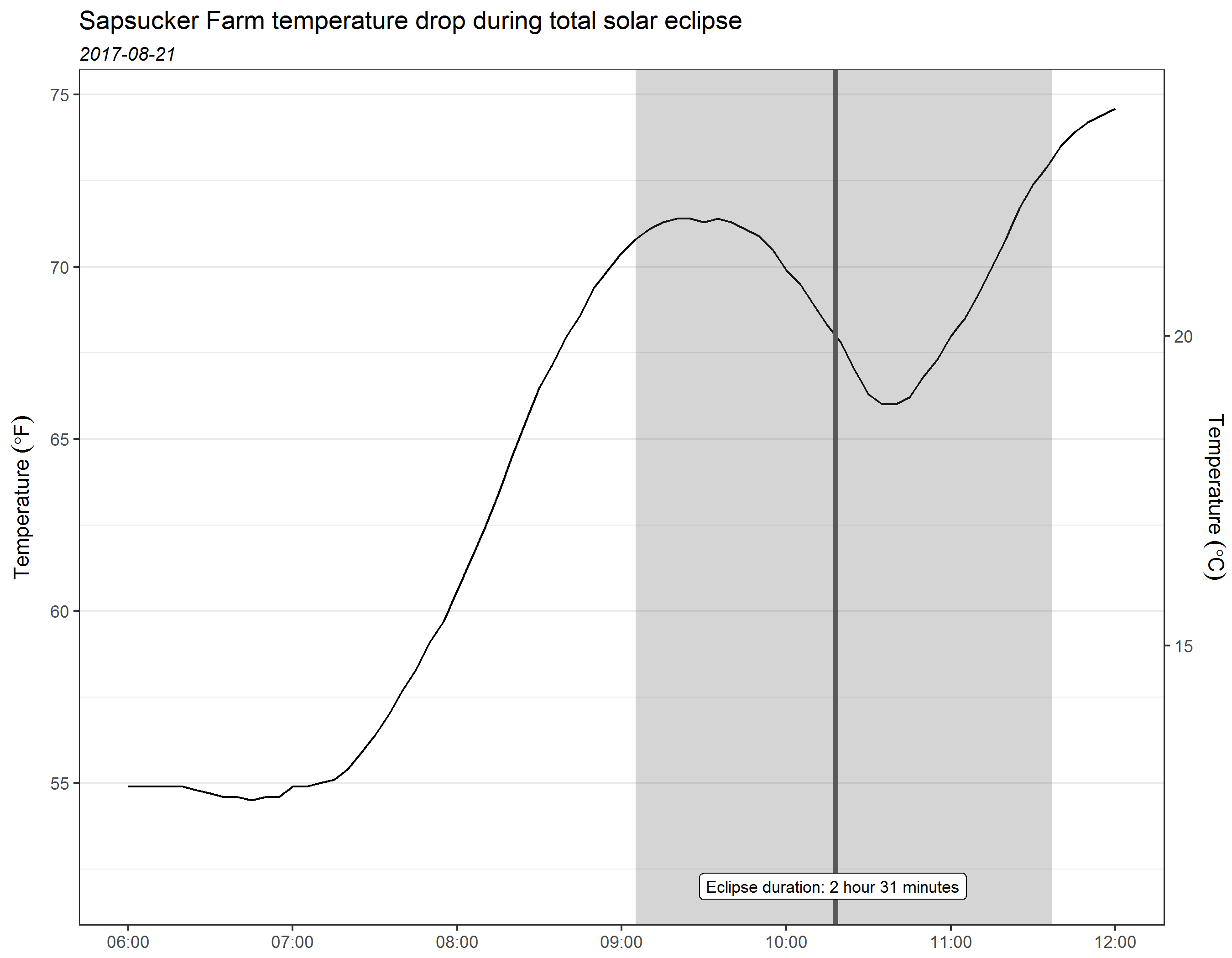
Looking at this now with new eyes, I see it might be nice replace the gray rectangle with one that goes from light to dark to light as the eclipse progresses to totality and then back. I’ll show how I tackled making a gradient color background in this post.
Table of Contents
Load R packages
I’ll load ggplot2 for plotting and dplyr for data manipulation.
library(ggplot2) # 3.2.1
library(dplyr) # 0.8.3
The dataset
My weather station records the temperature in °Fahrenheit every 5 minutes. I downloaded the data from 6 AM to 12 PM local time and cleaned it up a bit. The date-times and temperature are in a dataset I named temp. You can download this below if you’d like to play around with these data.
Download eclipse_temp.csv
Here are the first six lines of this temperature dataset.
head(temp) # A tibble: 6 x 2
datetime tempf
<dttm> <dbl>
1 2017-08-21 06:00:00 54.9
2 2017-08-21 06:05:00 54.9
3 2017-08-21 06:10:00 54.9
4 2017-08-21 06:15:00 54.9
5 2017-08-21 06:20:00 54.9
6 2017-08-21 06:25:00 54.8I also stored the start and end times of the eclipse and totality in data.frames, which I pulled for my location from this website.
If following along at home, make sure your time zones match for all the date-time variables or, from personal experience 🤣, you’ll run into problems.
eclipse = data.frame(start = as.POSIXct("2017-08-21 09:05:10"),
                     end = as.POSIXct("2017-08-21 11:37:19") )

totality = data.frame(start = as.POSIXct("2017-08-21 10:16:55"),
                      end = as.POSIXct("2017-08-21 10:18:52") )
Initial plot
I decided to make a plot of the temperature change during the eclipse only.
To keep the temperature line looking continuous, even though it’s taken every 5 minutes, I subset the data to times close but outside the start and end of the eclipse.
plottemp = filter(temp, between(datetime,
                                as.POSIXct("2017-08-21 09:00:00"),
                                as.POSIXct("2017-08-21 12:00:00") ) )
I then zoomed the plot to only include times encompassed by the eclipse with coord_cartesian(). I removed the x axis expansion in scale_x_datetime().
Since the plot covers only about 2 and half hours, I make breaks on the x axis every 15 minutes.
ggplot(plottemp) +
     geom_line( aes(datetime, tempf), size = 1 ) +
     scale_x_datetime( date_breaks = "15 min",
                       date_labels = "%H:%M",
                       expand = c(0, 0) ) +
     coord_cartesian(xlim = c(eclipse$start, eclipse$end) ) +
     labs(y = expression( Temperature~(degree*F) ),
          x = NULL,
          title = "Temperature during 2017-08-21 solar eclipse",
          subtitle = expression(italic("Sapsucker Farm, 09:05:10 - 11:37:19 PDT") ),
          caption = "Eclipse: 2 hours 32 minutes 9 seconds\nTotality: 1 minute 57 seconds"
     ) +
     scale_y_continuous(sec.axis = sec_axis(~ (. - 32) * 5 / 9 ,
                                            name =  expression( Temperature~(degree*C)),
                                            breaks = seq(16, 24, by = 1)) ) +
     theme_bw(base_size = 14) +
theme(panel.grid = element_blank() ) 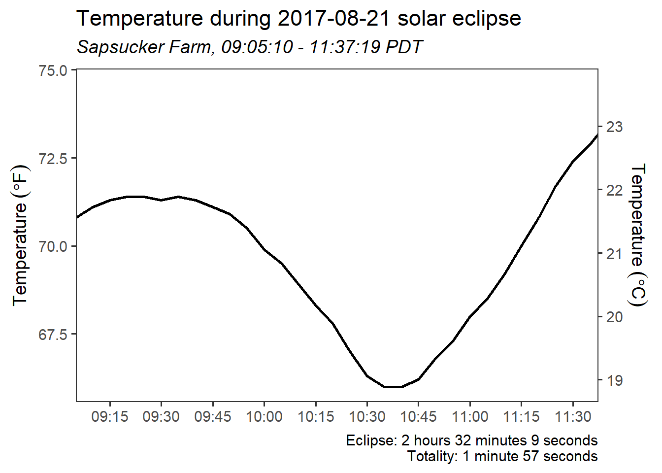
Adding color gradient using geom_segment()
I wanted the background of the plot to go from light to dark back to light through time. This means a color gradient should go from left to right across the plot.
Since the gradient will be based on time, I figured I could add a vertical line with geom_segment() for every second of the eclipse and color each segment based on how far that time was from totality.
Make a variable for the color mapping
The first step I took was to make variable with a row for every second of the eclipse, since I wanted a segment drawn for each second. I used seq.POSIXt for this.
color_dat = data.frame(time = seq(eclipse$start, eclipse$end, by = "1 sec") )Then came some hard thinking. How would I make a continuous variable to map to color? 🤔
While I don’t have an actual measurement of light throughout the eclipse, I can show the general idea of a light change with color by using a linear change in color from the start of the eclipse to totality and then another linear change in color from totality to the end of the eclipse.
My first idea for creating a variable was to use information on the current time vs totality start/end. After subtracting the times before totality from totality start and subtracting totality end from times after totality, I realized that the amount of time before totality wasn’t actually the same as the amount of time after totality. Back to the drawing board.
Since I was making a linear change in color, I realized I could make a sequence of values before totality and after totality that covered the same range but had a different total number of values. This would account for the difference in the length of time before and after totality. I ended up making a sequence going from 100 to 0 for times before totality and a sequence from 0 to 100 after totality. Times during totality were assigned a 0.
Here’s one way to get these sequences, using base::replace(). My dataset is in order by time, which is key to this working correctly.
color_dat = mutate(color_dat,
                   color = 0,
                   color = replace(color,
                                   time < totality$start,
                                   seq(100, 0, length.out = sum(time < totality$start) ) ),
                   color = replace(color,
                                   time > totality$end,
                                   seq(0, 100, length.out = sum(time > totality$end) ) ) )
Adding one geom_segment() per second
Once I had my color variable I was ready plot the segments along the x axis. Since the segments neeeded to go across the full height of the plot, I set y and yend to -Inf and Inf, respectively.
I put this layer first to use it as a background that the temperature line was plotted on top of.
g1 = ggplot(plottemp) +
     geom_segment(data = color_dat,
                  aes(x = time, xend = time,
                      y = -Inf, yend = Inf, color = color),
                  show.legend = FALSE) +
     geom_line( aes(datetime, tempf), size = 1 ) +
     scale_x_datetime( date_breaks = "15 min",
                       date_labels = "%H:%M",
                       expand = c(0, 0) ) +
     coord_cartesian(xlim = c(eclipse$start, eclipse$end) ) +
     labs(y = expression( Temperature~(degree*F) ),
          x = NULL,
          title = "Temperature during 2017-08-21 solar eclipse",
          subtitle = expression(italic("Sapsucker Farm, 09:05:10 - 11:37:19 PDT") ),
          caption = "Eclipse: 2 hours 32 minutes 9 seconds\nTotality: 1 minute 57 seconds"
     ) +
     scale_y_continuous(sec.axis = sec_axis(~ (. - 32) * 5 / 9 ,
                                            name =  expression( Temperature~(degree*C)),
                                            breaks = seq(16, 24, by = 1)) ) +
     theme_bw(base_size = 14) +
     theme(panel.grid = element_blank() )

g1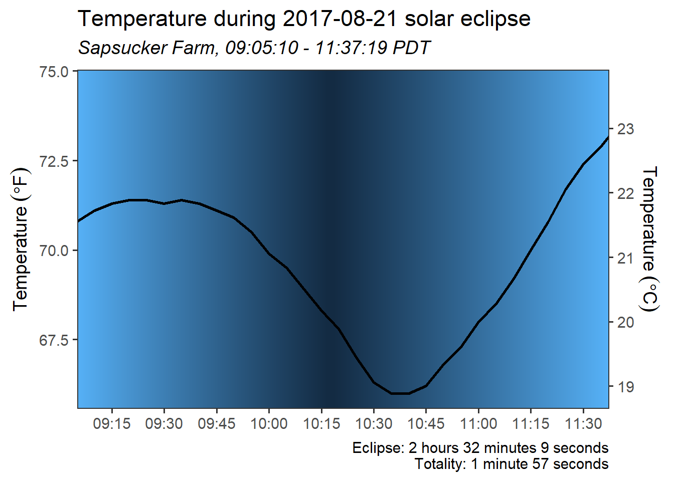
Switching to a gray scale
The default blue color scheme for the segments actually works OK, but I was picturing going from white to dark. I picked gray colors with grDevices::gray.colors() in scale_color_gradient(). In gray.colors(), 0 is black and 1 is white. I didn’t want the colors to go all the way to black, since that would make the temperature line impossible to see during totality. And, of course, it’s not actually pitch black during totality. 😁
g1 + scale_color_gradient(low = gray.colors(1, 0.25),
                          high = gray.colors(1, 1) )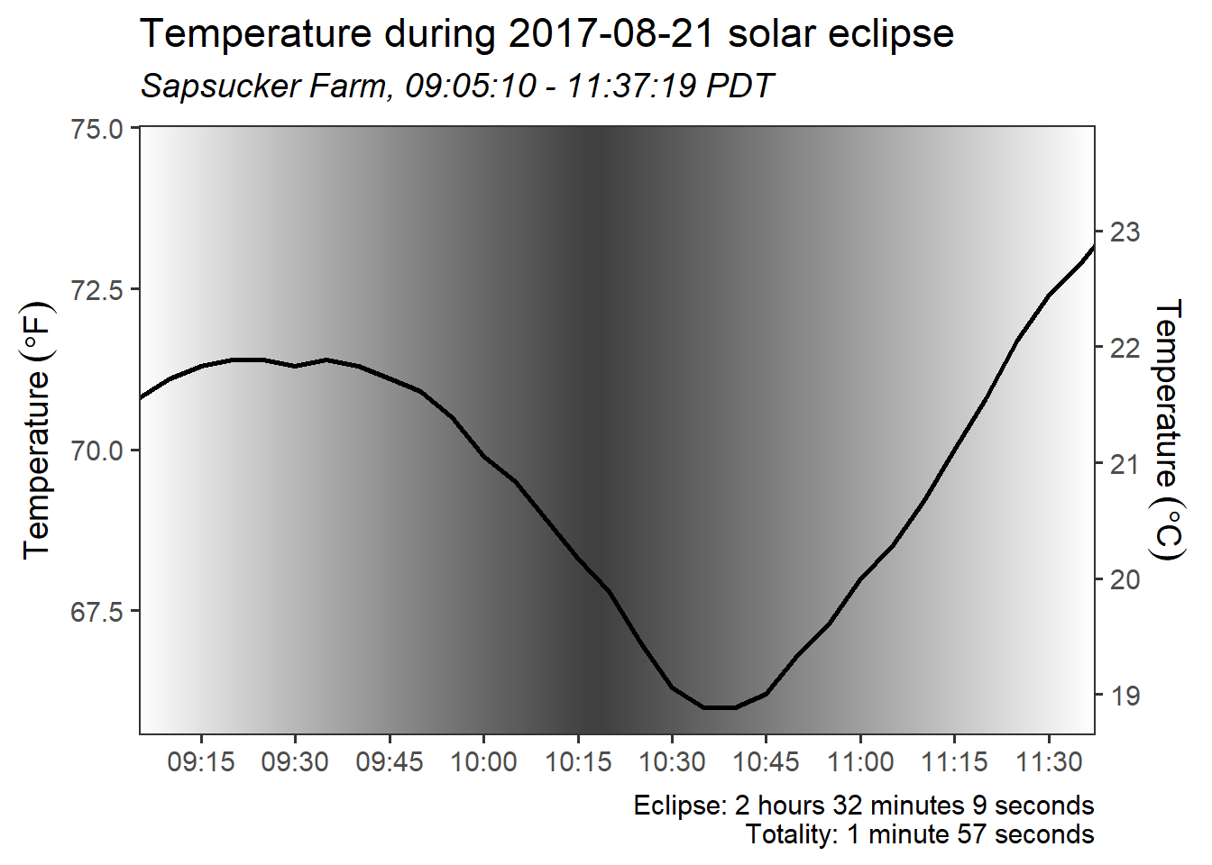
Using segments to make a gradient rectangle
I can use this same approach on only a portion of the x axis to give the appearance of a rectangle with gradient fill. Here’s an example using times outside the eclipse.
g2 = ggplot(temp) +
     geom_segment(data = color_dat,
                  aes(x = time, xend = time,
                      y = -Inf, yend = Inf, color = color),
                  show.legend = FALSE) +
     geom_line( aes(datetime, tempf), size = 1 ) +
     scale_x_datetime( date_breaks = "1 hour",
                       date_labels = "%H:%M",
                       expand = c(0, 0) ) +
     labs(y = expression( Temperature~(degree*F) ),
          x = NULL,
          title = "Temperature during 2017-08-21 solar eclipse",
          subtitle = expression(italic("Sapsucker Farm, Dallas, OR, USA") ),
          caption = "Eclipse: 2 hours 32 minutes 9 seconds\nTotality: 1 minute 57 seconds"
     ) +
     scale_y_continuous(sec.axis = sec_axis(~ (. - 32) * 5 / 9 ,
                                            name =  expression( Temperature~(degree*C)),
                                            breaks = seq(12, 24, by = 2)) ) +
     scale_color_gradient(low = gray.colors(1, .25),
                          high = gray.colors(1, 1) ) +
     theme_bw(base_size = 14) +
     theme(panel.grid.major.x = element_blank(),
           panel.grid.minor = element_blank() )

g2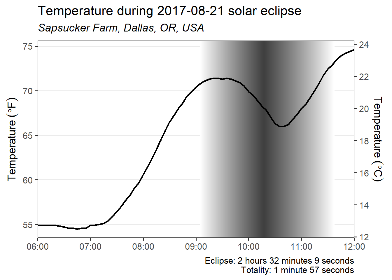
Bonus: annotations with curved arrows
This second plot gives me a chance to try out Cédric Scherer’s very cool curved annotation arrow idea for the first time 🎉.
g2 = g2 +
     annotate("text", x = as.POSIXct("2017-08-21 08:00"),
              y = 74,
              label = "Partial eclipse begins\n09:05:10 PDT",
              color = "grey24") +
     annotate("text", x = as.POSIXct("2017-08-21 09:00"),
              y = 57,
              label = "Totality begins\n10:16:55 PDT",
              color = "grey24")
g2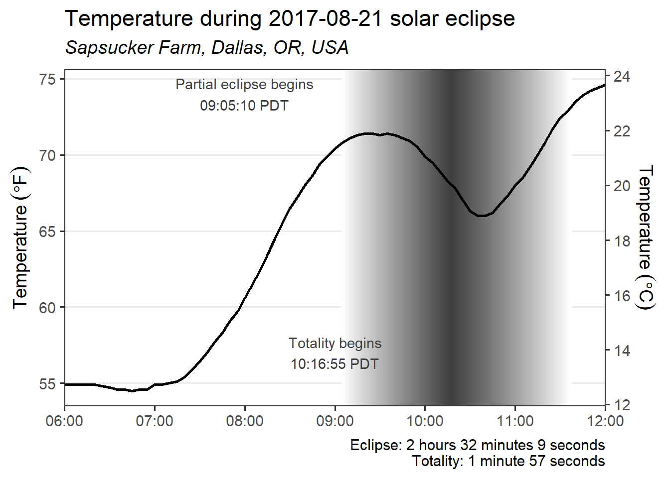
I’ll make a data.frame for the arrow start/end positions. I’m skipping all the work it took to get the positions where I wanted them, which is always iterative for me.
arrows = data.frame(x1 = as.POSIXct( c("2017-08-21 08:35",
                                      "2017-08-21 09:34") ),
                    x2 = c(eclipse$start, totality$start),
                    y1 = c(74, 57.5),
                    y2 = c(72.5, 60) )
I add arrows with geom_curve(). I changed the size of the arrowhead and made it closed in arrow(). I also thought the arrows looked better with a little less curvature.
g2 +
     geom_curve(data = arrows,
                aes(x = x1, xend = x2,
                    y = y1, yend = y2),
                arrow = arrow(length = unit(0.075, "inches"),
                              type = "closed"),
                curvature = 0.25)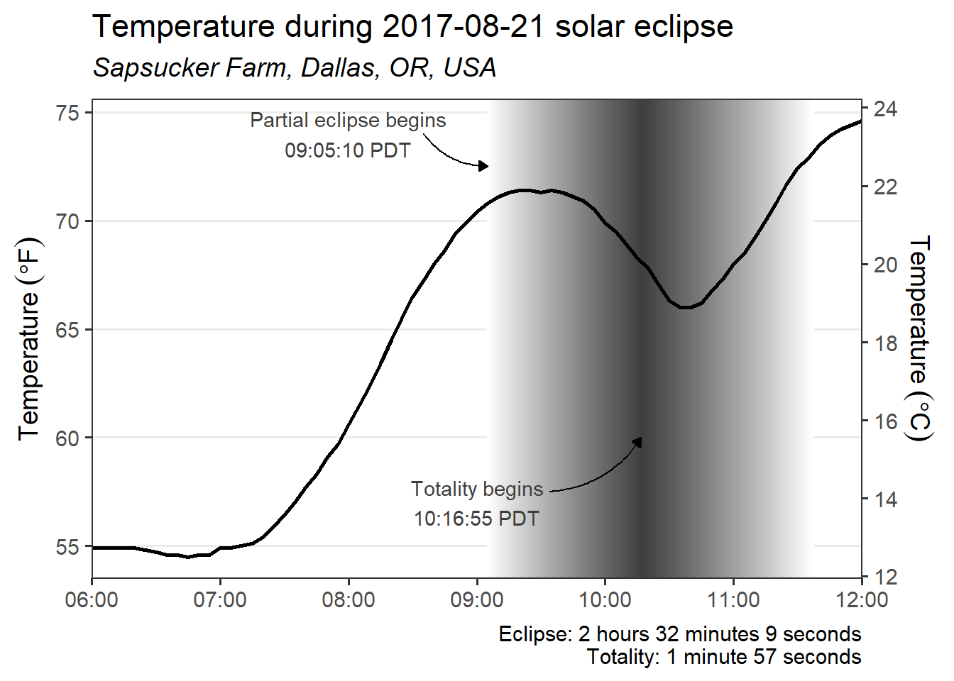
Other ways to make a gradient color background
Based on a bunch of internet searches, it looks like a gradient background in ggplot2 generally takes some work. There are some nice examples out there on how to use rasterGrob() and annotate_custom() to add background gradients, such as in this Stack Overflow question. I haven’t researched how to make this go from light to dark and back to light for the uneven time scale like in my example.
I’ve also seen approaches involving dataset expansion and drawing many filled rectangles or using rasters, which is like what I did with geom_segment().
Eclipses!
Before actually experiencing totality, it seemed to me like the difference between a 99% and a 100% eclipse wasn’t a big deal. I mean, those numbers are pretty darn close.
I was very wrong. 😜
If you ever are lucky enough to be near a path of totality, definitely try to get there even if it’s a little more trouble then the 99.9% partial eclipse. It’s an amazing experience. 😻

Just the code, please
Here’s the code without all the discussion. Copy and paste the code below or you can download an R script of uncommented code from here.
library(ggplot2) # 3.2.1
library(dplyr) # 0.8.3

head(temp)
eclipse = data.frame(start = as.POSIXct("2017-08-21 09:05:10"),
                     end = as.POSIXct("2017-08-21 11:37:19") )

totality = data.frame(start = as.POSIXct("2017-08-21 10:16:55"),
                      end = as.POSIXct("2017-08-21 10:18:52") )

plottemp = filter(temp, between(datetime,
                                as.POSIXct("2017-08-21 09:00:00"),
                                as.POSIXct("2017-08-21 12:00:00") ) )
ggplot(plottemp) +
     geom_line( aes(datetime, tempf), size = 1 ) +
     scale_x_datetime( date_breaks = "15 min",
                       date_labels = "%H:%M",
                       expand = c(0, 0) ) +
     coord_cartesian(xlim = c(eclipse$start, eclipse$end) ) +
     labs(y = expression( Temperature~(degree*F) ),
          x = NULL,
          title = "Temperature during 2017-08-21 solar eclipse",
          subtitle = expression(italic("Sapsucker Farm, 09:05:10 - 11:37:19 PDT") ),
          caption = "Eclipse: 2 hours 32 minutes 9 seconds\nTotality: 1 minute 57 seconds"
     ) +
     scale_y_continuous(sec.axis = sec_axis(~ (. - 32) * 5 / 9 ,
                                            name =  expression( Temperature~(degree*C)),
                                            breaks = seq(16, 24, by = 1)) ) +
     theme_bw(base_size = 14) +
     theme(panel.grid = element_blank() )
color_dat = data.frame(time = seq(eclipse$start, eclipse$end, by = "1 sec") )
color_dat = mutate(color_dat,
                   color = 0,
                   color = replace(color,
                                   time < totality$start,
                                   seq(100, 0, length.out = sum(time < totality$start) ) ),
                   color = replace(color,
                                   time > totality$end,
                                   seq(0, 100, length.out = sum(time > totality$end) ) ) )
g1 = ggplot(plottemp) +
     geom_segment(data = color_dat,
                  aes(x = time, xend = time,
                      y = -Inf, yend = Inf, color = color),
                  show.legend = FALSE) +
     geom_line( aes(datetime, tempf), size = 1 ) +
     scale_x_datetime( date_breaks = "15 min",
                       date_labels = "%H:%M",
                       expand = c(0, 0) ) +
     coord_cartesian(xlim = c(eclipse$start, eclipse$end) ) +
     labs(y = expression( Temperature~(degree*F) ),
          x = NULL,
          title = "Temperature during 2017-08-21 solar eclipse",
          subtitle = expression(italic("Sapsucker Farm, 09:05:10 - 11:37:19 PDT") ),
          caption = "Eclipse: 2 hours 32 minutes 9 seconds\nTotality: 1 minute 57 seconds"
     ) +
     scale_y_continuous(sec.axis = sec_axis(~ (. - 32) * 5 / 9 ,
                                            name =  expression( Temperature~(degree*C)),
                                            breaks = seq(16, 24, by = 1)) ) +
     theme_bw(base_size = 14) +
     theme(panel.grid = element_blank() )

g1

g1 + scale_color_gradient(low = gray.colors(1, 0.25),
                          high = gray.colors(1, 1) )
g2 = ggplot(temp) +
     geom_segment(data = color_dat,
                  aes(x = time, xend = time,
                      y = -Inf, yend = Inf, color = color),
                  show.legend = FALSE) +
     geom_line( aes(datetime, tempf), size = 1 ) +
     scale_x_datetime( date_breaks = "1 hour",
                       date_labels = "%H:%M",
                       expand = c(0, 0) ) +
     labs(y = expression( Temperature~(degree*F) ),
          x = NULL,
          title = "Temperature during 2017-08-21 solar eclipse",
          subtitle = expression(italic("Sapsucker Farm, Dallas, OR, USA") ),
          caption = "Eclipse: 2 hours 32 minutes 9 seconds\nTotality: 1 minute 57 seconds"
     ) +
     scale_y_continuous(sec.axis = sec_axis(~ (. - 32) * 5 / 9 ,
                                            name =  expression( Temperature~(degree*C)),
                                            breaks = seq(12, 24, by = 2)) ) +
     scale_color_gradient(low = gray.colors(1, .25),
                          high = gray.colors(1, 1) ) +
     theme_bw(base_size = 14) +
     theme(panel.grid.major.x = element_blank(),
           panel.grid.minor = element_blank() )

g2
g2 = g2 +
     annotate("text", x = as.POSIXct("2017-08-21 08:00"),
              y = 74,
              label = "Partial eclipse begins\n09:05:10 PDT",
              color = "grey24") +
     annotate("text", x = as.POSIXct("2017-08-21 09:00"),
              y = 57,
              label = "Totality begins\n10:16:55 PDT",
              color = "grey24")
g2

arrows = data.frame(x1 = as.POSIXct( c("2017-08-21 08:35",
                                      "2017-08-21 09:34") ),
                    x2 = c(eclipse$start, totality$start),
                    y1 = c(74, 57.5),
                    y2 = c(72.5, 60) )
g2 +
     geom_curve(data = arrows,
                aes(x = x1, xend = x2,
                    y = y1, yend = y2),
                arrow = arrow(length = unit(0.075, "inches"),
                              type = "closed"),
                curvature = 0.25)