Making many added variable plots with purrr and ggplot2
This post was last updated on 2021-08-05.
Last week two of my consulting meetings ended up on the same topic: making added variable plots.
In both cases, the student had a linear model of some flavor that had several continuous explanatory variables. They wanted to plot the estimated relationship between each variable in the model and the response. This could easily lead to a lot of copying and pasting of code, since they want to do the same thing for every explanatory variable in the model. I worked up some example code showing an approach on how one might automate the task in R with functions and loops, and thought I’d generalize it for a blog post.
Table of Contents
- The basics of added variable plots
- R packages
- The linear model
- The explanatory variables
- A function for making a prediction dataset
- Making a prediction dataset for each variable
- Calculate model predictions for each variable
- Making one added variable plot
- Build a plotting function
- Making all the plots
- Just the code, please
The basics of added variable plots
Added variable plots (aka partial regression plots, adjusted variable plots, individual coefficient plots), are “results” plots. They are plots showing the estimated relationship between the response and an explanatory variable after accounting for the other variables in the model. If working with only two continuous explanatory variables, a 3-dimensional plot could be used in place of an added variable plot (if one likes those sorts of plots 😃). Once there are many variables in the model, though, we don’t have enough plotting dimensions to show how all the variables relate to the response simultaneously and so we often use variable plots to show the fitted relationships.
There are packages available for making added variable plots in R, such as effects and visreg. I like a bit more flexibility, which I get by making my own plots. To do this I need to extract the appropriate predictions and confidence intervals from the model.
When making an added variable plot, it is fairly standard to make the predictions with all other variables fixed to their medians or means. I use medians today. Note that in my example I’m demonstrating code for the relatively simple case where there are no interactions between continuous variables in the model. Continuous-by-continuous interactions would involve a more complicated set-up for making plots.
R packages
The main workhorses I’m using today is purrr for looping through variables/lists and ggplot2 for plotting. I also use helper functions from dplyr for data manipulation and broom for getting the model predictions and standard errors.
library(dplyr) # v. 1.0.7
library(ggplot2) # v. 3.3.5
library(purrr) # v. 0.3.4
library(broom) # v. 0.7.9
The linear model
My example model is a linear model with a transformed response variable, fit using lm(). The process works the same for generalized linear models fit with glm() and would be very similar for other linear models (although you may have to calculate any standard errors manually).
My linear model is based on five continuous variable from the mtcars dataset.
The model I fit uses a log transformation for the response variable, so predictions and confidence interval limits will need to be back-transformed prior to plotting to show the relationship between the variables on the response on the original scale. If you don’t have a transformation you can skip this step.
fit1 = lm( log(mpg) ~ disp + hp + drat + wt, data = mtcars)
summary(fit1)
#
# Call:
# lm(formula = log(mpg) ~ disp + hp + drat + wt, data = mtcars)
#
# Residuals:
# Min 1Q Median 3Q Max
# -0.16449 -0.08240 -0.03421 0.08048 0.26221
#
# Coefficients:
# Estimate Std. Error t value Pr(>|t|)
# (Intercept) 3.5959909 0.2746352 13.094 3.29e-13 ***
# disp -0.0001296 0.0004715 -0.275 0.78553
# hp -0.0014709 0.0005061 -2.906 0.00722 **
# drat 0.0445959 0.0575916 0.774 0.44545
# wt -0.1719512 0.0470572 -3.654 0.00110 **
# ---
# Signif. codes: 0 '***' 0.001 '**' 0.01 '*' 0.05 '.' 0.1 ' ' 1
#
# Residual standard error: 0.1136 on 27 degrees of freedom
# Multiple R-squared: 0.8733, Adjusted R-squared: 0.8546
# F-statistic: 46.54 on 4 and 27 DF, p-value: 9.832e-12The explanatory variables
The approach I’m going to take is to loop through the explanatory variables in the model, create datasets for prediction, get the predictions, and make the plots. I’ll end with one added variable plot per variable.
I could write out a vector of variable names to loop through manually, but I prefer to pull them out of the model. In the approach I use the first variable in the output is the response variable. I don’t need the response variable here, so I remove it with -1.
( mod_vars = all.vars( formula(fit1) )[-1] )# [1] "disp" "hp" "drat" "wt"A function for making a prediction dataset
The first step in making an added variable plot manually is to create the dataset to use for calculating model predictions. This dataset will contain the observed data for the explanatory variable of interest (aka the focus variable) with all other variables fixed to their medians.
Below is a function for doing this task:
- The function takes a dataset, a vector of all the variables in the model (as strings), and the name of the focus variable (as a string).
- The dplyr
*_at()functions can take strings as input, so I usesummarise_at()to calculate the medians of the non-focus variables.
- I bind the summary values to the focus variable data from the original dataset with
cbind(), sincecbind()allows recycling to repeat the single values for the whole length of the focus variable.
preddat_fun = function(data, allvars, var) {
     sums = summarise_at(data,
                         vars( one_of(allvars), -one_of(var) ),
                         median)
     cbind( select_at(data, var), sums)
}
Here’s what the result of the function looks like for a single focus variable, “disp” (showing first six rows).
head( preddat_fun(mtcars, mod_vars, "disp") )# disp hp drat wt
# Mazda RX4 160 123 3.695 3.325
# Mazda RX4 Wag 160 123 3.695 3.325
# Datsun 710 108 123 3.695 3.325
# Hornet 4 Drive 258 123 3.695 3.325
# Hornet Sportabout 360 123 3.695 3.325
# Valiant 225 123 3.695 3.325Making a prediction dataset for each variable
Now that I have a working function, I can loop through each variable in the mod_vars vector and create a prediction dataset for each one. I’ll use map() from purrr for the loop. I use set_names() prior to map() so each element of the resulting list will be labeled with the name of the focus variable of that dataset. This helps me stay organized.
The result is a list of prediction datasets, one for each variable in my model.
pred_dats = mod_vars %>%
     set_names() %>%
     map( ~preddat_fun(mtcars, mod_vars, .x) )
str(pred_dats)
# List of 4
# $ disp:'data.frame': 32 obs. of 4 variables:
# ..$ disp: num [1:32] 160 160 108 258 360 ...
# ..$ hp : num [1:32] 123 123 123 123 123 123 123 123 123 123 ...
# ..$ drat: num [1:32] 3.7 3.7 3.7 3.7 3.7 ...
# ..$ wt : num [1:32] 3.33 3.33 3.33 3.33 3.33 ...
# $ hp :'data.frame': 32 obs. of 4 variables:
# ..$ hp : num [1:32] 110 110 93 110 175 105 245 62 95 123 ...
# ..$ disp: num [1:32] 196 196 196 196 196 ...
# ..$ drat: num [1:32] 3.7 3.7 3.7 3.7 3.7 ...
# ..$ wt : num [1:32] 3.33 3.33 3.33 3.33 3.33 ...
# $ drat:'data.frame': 32 obs. of 4 variables:
# ..$ drat: num [1:32] 3.9 3.9 3.85 3.08 3.15 2.76 3.21 3.69 3.92 3.92 ...
# ..$ disp: num [1:32] 196 196 196 196 196 ...
# ..$ hp : num [1:32] 123 123 123 123 123 123 123 123 123 123 ...
# ..$ wt : num [1:32] 3.33 3.33 3.33 3.33 3.33 ...
# $ wt :'data.frame': 32 obs. of 4 variables:
# ..$ wt : num [1:32] 2.62 2.88 2.32 3.21 3.44 ...
# ..$ disp: num [1:32] 196 196 196 196 196 ...
# ..$ hp : num [1:32] 123 123 123 123 123 123 123 123 123 123 ...
# ..$ drat: num [1:32] 3.7 3.7 3.7 3.7 3.7 ...Calculate model predictions for each variable
Once the prediction datasets are created, the predictions can be calculated from the model and added to each dataset. I do this on the model scale, since I want to make confidence intervals with the standard errors prior to back-transforming.
The augment() function from broom works with a variety of model objects, including lm and glm objects. It can take new datasets for prediction via the newdata argument.
This is what the first six lines of output look like for one prediction dataset. Note I get standard errors for each predicting using the se_fit argument. I’ll use these to build confidence intervals.
head( augment(fit1, newdata = pred_dats[[1]], se_fit = TRUE))# # A tibble: 6 x 7
# .rownames disp hp drat wt .fitted .se.fit
# <chr> <dbl> <dbl> <dbl> <dbl> <dbl> <dbl>
# 1 Mazda RX4 160 123 3.70 3.32 2.99 0.0367
# 2 Mazda RX4 Wag 160 123 3.70 3.32 2.99 0.0367
# 3 Datsun 710 108 123 3.70 3.32 2.99 0.0574
# 4 Hornet 4 Drive 258 123 3.70 3.32 2.97 0.0309
# 5 Hornet Sportabout 360 123 3.70 3.32 2.96 0.0713
# 6 Valiant 225 123 3.70 3.32 2.98 0.0247To do this for every variable, I’ll loop through the prediction datasets with map(). I first to add the predictions via augment() and then to calculate approximate confidence intervals.
Since my response was on the log scale, I back-transform the predictions and confidence interval limits to the original data scale in this step. This step isn’t needed for a model without a transformation or link function.
preds = pred_dats %>%
     map(~augment(fit1, newdata = .x, se_fit = TRUE) ) %>%
     map(~mutate(.x,
                 lower = exp(.fitted - 2*.se.fit),
                 upper = exp(.fitted + 2*.se.fit),
                 pred = exp(.fitted) ) )
Here is what the structure of the list elements look like now (showing only the first list element).
str(preds$disp)# tibble [32 x 10] (S3: tbl_df/tbl/data.frame)
# $ .rownames: chr [1:32] "Mazda RX4" "Mazda RX4 Wag" "Datsun 710" "Hornet 4 Drive" ...
# $ disp : num [1:32] 160 160 108 258 360 ...
# $ hp : num [1:32] 123 123 123 123 123 123 123 123 123 123 ...
# $ drat : num [1:32] 3.7 3.7 3.7 3.7 3.7 ...
# $ wt : num [1:32] 3.33 3.33 3.33 3.33 3.33 ...
# $ .fitted : num [1:32] 2.99 2.99 2.99 2.97 2.96 ...
# $ .se.fit : Named num [1:32] 0.0367 0.0367 0.0574 0.0309 0.0713 ...
# ..- attr(*, "names")= chr [1:32] "Mazda RX4" "Mazda RX4 Wag" "Datsun 710" "Hornet 4 Drive" ...
# $ lower : Named num [1:32] 18.4 18.4 17.8 18.4 16.8 ...
# ..- attr(*, "names")= chr [1:32] "Mazda RX4" "Mazda RX4 Wag" "Datsun 710" "Hornet 4 Drive" ...
# $ upper : Named num [1:32] 21.3 21.3 22.4 20.8 22.3 ...
# ..- attr(*, "names")= chr [1:32] "Mazda RX4" "Mazda RX4 Wag" "Datsun 710" "Hornet 4 Drive" ...
# $ pred : num [1:32] 19.8 19.8 20 19.6 19.3 ...Making one added variable plot
With the predictions successfully made it’s time for plotting.
Here is the format of the plots I will be making, plotting the fitted line and showing the data on the x axis with a rug plot. I make the output black and white with larger text via theme_bw(base_size = 14) and clean up the axis labels via labs().
ggplot(data = preds$disp, aes(x = disp, y = pred) ) +
     geom_line(size = 1) +
     geom_ribbon(aes(ymin = lower, ymax = upper), alpha = .25) +
     geom_rug(sides = "b") +
     theme_bw(base_size = 14) +
     labs(x = "Displacement (cu.in.)",
          y = "Miles/(US) gallon") +
     ylim(10, 32)
Build a plotting function
Once I’ve worked out what one plot should look like I can make function for making all the plots. This is a reasonable approach for when making many plots that all look basically the same.
One problem I anticipated running into when automating the plotting is with the x axis labels. The variable names in the dataset aren’t very nice looking. If I want the x axis labels to be more polished in the plots I’ll need replacement labels. I decided to make a vector of nicer labels, one label for each focus variable. This vector needs to be the same length and in the same order as the vector of variable names and the list of prediction datasets so each plot gets the correct new axis label.
xlabs = c("Displacement (cu.in.)",
          "Gross horsepower",
          "Rear axle ratio",
          "Weight (1000 lbs)")
My plotting function has three arguments: the dataset to plot, the explanatory variable to plot on the x axis (as a string), and label for the x axis (also as a string).
I will use the .data pronoun for passing strings in aes(). This approach became available starting with rlang version 0.4.0.
If using earlier versions of ggplot2 and rlang, use aes_string() with code aes_string(x = variable, y = "pred"). Note your variable names for x must by syntactically valid to use the aes_string() approach.
pred_plot = function(data, variable, xlab) {
     ggplot(data, aes(x = .data[[variable]], y = pred) ) +
          geom_line(size = 1) +
          geom_ribbon(aes(ymin = lower, ymax = upper), alpha = .25) +
          geom_rug(sides = "b") +
          theme_bw(base_size = 14) +
          labs(x = xlab,
               y = "Miles/(US) gallon") +
          ylim(10, 32)
}
Here is the plotting function in action. I plot the “disp” variable, which is the first element of the three lists (prediction datasets, variables, axis labels). This looks just like the plot I manually made above.
pred_plot(preds[[1]], mod_vars[1], xlabs[1])
Making all the plots
The very last step is to make all the plots. Because I want to loop through three different lists (the prediction datasets, the variables, and the axis labels), this can be a done via pmap() from purrr. The pmap() function loops through all three lists simultaneously.
all_plots = pmap( list(preds, mod_vars, xlabs), pred_plot)
all_plots
# $disp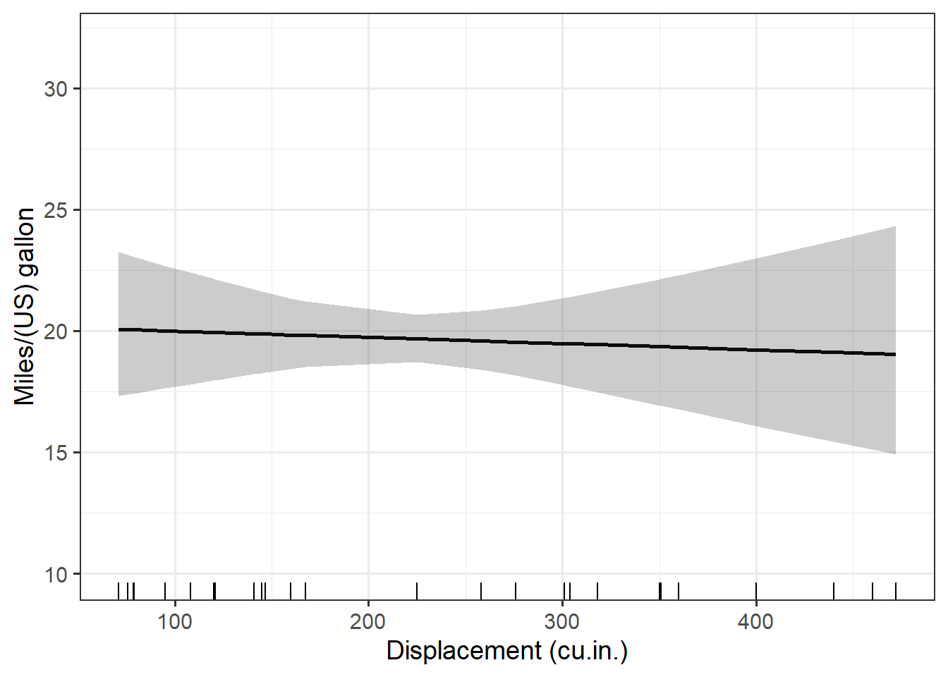
#
# $hp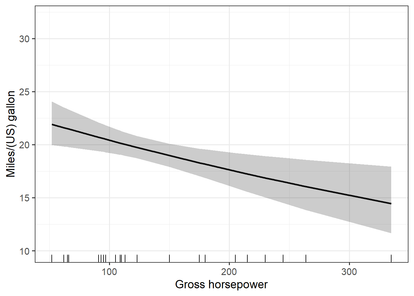
#
# $drat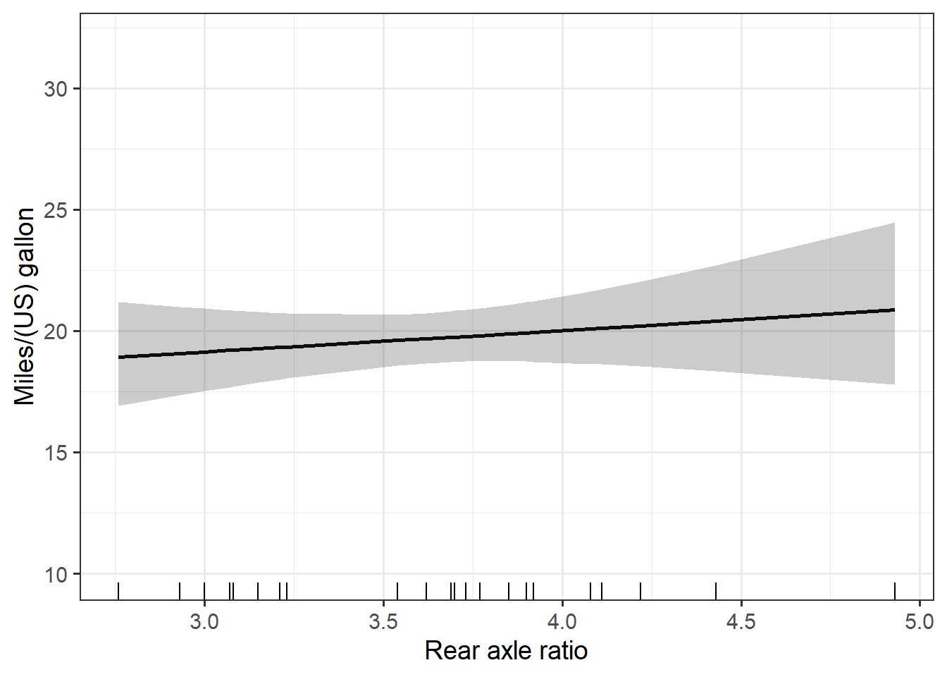
#
# $wt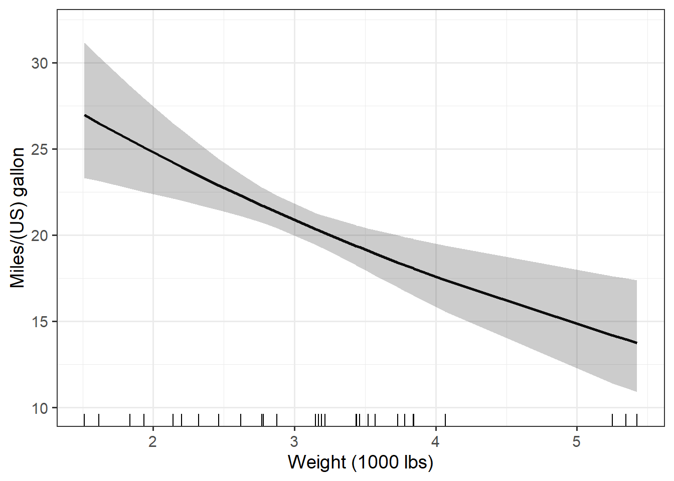
Using the plots
The plots can be printed all at once as above or individually using indexes or list names, using code such as all_plots[[1]] or all_plots$disp. Plots can also be saved for use outside of R. I show some examples of how to do this in a different post.
It might be nice to combine these individual plots into a single multi-plot. A faceted plot would be an option, but the approach I’ve done here in its current form isn’t a great one for faceting.
The individual plots can be combined into a single figure via function from the cowplot package, though, without too much trouble. Also see package patchwork.
The plot_grid() function can take a list of plots, which is what I have. It has a variety of options you might want to explore for getting the plots stitched together nicely.
cowplot::plot_grid(plotlist = all_plots,
          labels = "AUTO",
          align = "hv")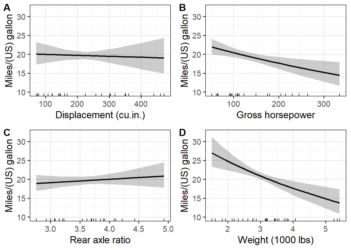
Addendum: Package rms makes added variable plots via ggplot2 and plotly along with simultaneous confidence bands for any model type the package works with. That includes linear models and generalized linear models excluding the negative binomial family. This may be a useful place to start if you are working with these kinds of models.
Just the code, please
Here’s the code without all the discussion. Copy and paste the code below or you can download an R script of uncommented code from here.
library(dplyr) # v. 1.0.7
library(ggplot2) # v. 3.3.5
library(purrr) # v. 0.3.4
library(broom) # v. 0.7.9

fit1 = lm( log(mpg) ~ disp + hp + drat + wt, data = mtcars)
summary(fit1)

( mod_vars = all.vars( formula(fit1) )[-1] )

preddat_fun = function(data, allvars, var) {
     sums = summarise_at(data,
                         vars( one_of(allvars), -one_of(var) ),
                         median)
     cbind( select_at(data, var), sums)
}

head( preddat_fun(mtcars, mod_vars, "disp") )

pred_dats = mod_vars %>%
     set_names() %>%
     map( ~preddat_fun(mtcars, mod_vars, .x) )
str(pred_dats)

head( augment(fit1, newdata = pred_dats[[1]], se_fit = TRUE))

preds = pred_dats %>%
     map(~augment(fit1, newdata = .x, se_fit = TRUE) ) %>%
     map(~mutate(.x,
                 lower = exp(.fitted - 2*.se.fit),
                 upper = exp(.fitted + 2*.se.fit),
                 pred = exp(.fitted) ) )

str(preds$disp)
ggplot(data = preds$disp, aes(x = disp, y = pred) ) +
     geom_line(size = 1) +
     geom_ribbon(aes(ymin = lower, ymax = upper), alpha = .25) +
     geom_rug(sides = "b") +
     theme_bw(base_size = 14) +
     labs(x = "Displacement (cu.in.)",
          y = "Miles/(US) gallon") +
     ylim(10, 32)

xlabs = c("Displacement (cu.in.)",
          "Gross horsepower",
          "Rear axle ratio",
          "Weight (1000 lbs)")

pred_plot = function(data, variable, xlab) {
     ggplot(data, aes(x = .data[[variable]], y = pred) ) +
          geom_line(size = 1) +
          geom_ribbon(aes(ymin = lower, ymax = upper), alpha = .25) +
          geom_rug(sides = "b") +
          theme_bw(base_size = 14) +
          labs(x = xlab,
               y = "Miles/(US) gallon") +
          ylim(10, 32)
}

pred_plot(preds[[1]], mod_vars[1], xlabs[1])

all_plots = pmap( list(preds, mod_vars, xlabs), pred_plot)
all_plots

cowplot::plot_grid(plotlist = all_plots,
          labels = "AUTO",
          align = "hv")