Reversing the order of a ggplot2 legend
It’s always nice to get good questions in a workshop. It can help everybody, including the instructor, get a bit of extra learnin’ in.
Every spring I give a ggplot2 workshop for graduate students in my college. The first half is focused on the terminology and understanding the basics of how to put a plot together (I remember as a beginner feeling like I was throwing darts at things to see what stuck when deciding if something should go inside or outside aes() 🎯 ).
The second half is spent more on making more “final” versions of plots, which is where the question came up.
Table of Contents
Plotting dataset
I have a “results” dataset I use for one of the “final” plot examples, displaying the results from some statistical model used to answer a question about differences in mean response between some groups vs a control group.
res = structure(list(Diffmeans = c(-0.27, 0.11, -0.15, -1.27, -1.18
), Lower.CI = c(-0.63, -0.25, -0.51, -1.63, -1.54), Upper.CI = c(0.09,
0.47, 0.21, -0.91, -0.82), plantdate = structure(c(1L, 2L, 2L,
3L, 3L), .Label = c("January 2", "January 28", "February 25"), class = "factor"),
    stocktype = structure(c(2L, 2L, 1L, 2L, 1L), .Label = c("bare",
    "cont"), class = "factor")), .Names = c("Diffmeans", "Lower.CI",
"Upper.CI", "plantdate", "stocktype"), row.names = c(NA, -5L), class = "data.frame")
Original plot
In the workshop, making a plot of these results is done in many stages to demonstrate controlling scales and themes and dodging, etc. At one point during the workshop the graph looks like this.
library(ggplot2)

( g1 = ggplot(res, aes(x = plantdate, y = Diffmeans, group = stocktype) ) +
    geom_point(position = position_dodge(width = .75) ) +
    geom_errorbar( aes(ymin = Lower.CI, ymax = Upper.CI,
                       linetype = stocktype,
                       width = c(.2, .4, .4, .4, .4) ),
                   position = position_dodge(width = .75) ) +
      theme_bw() +
      labs(y = "Difference in Growth (cm)",
           x = "Planting Date") +
      geom_rect(xmin = -Inf, xmax = Inf, ymin = -.25, ymax = .25,
            fill = "grey54", alpha = .05) +
      scale_y_continuous(breaks = seq(-1.5, .5, by = .25) ) +
      coord_flip() +
      scale_linetype_manual(values = c("solid", "twodash"),
                            name = element_blank(),
                            labels = c("Bare root", "Container") ) )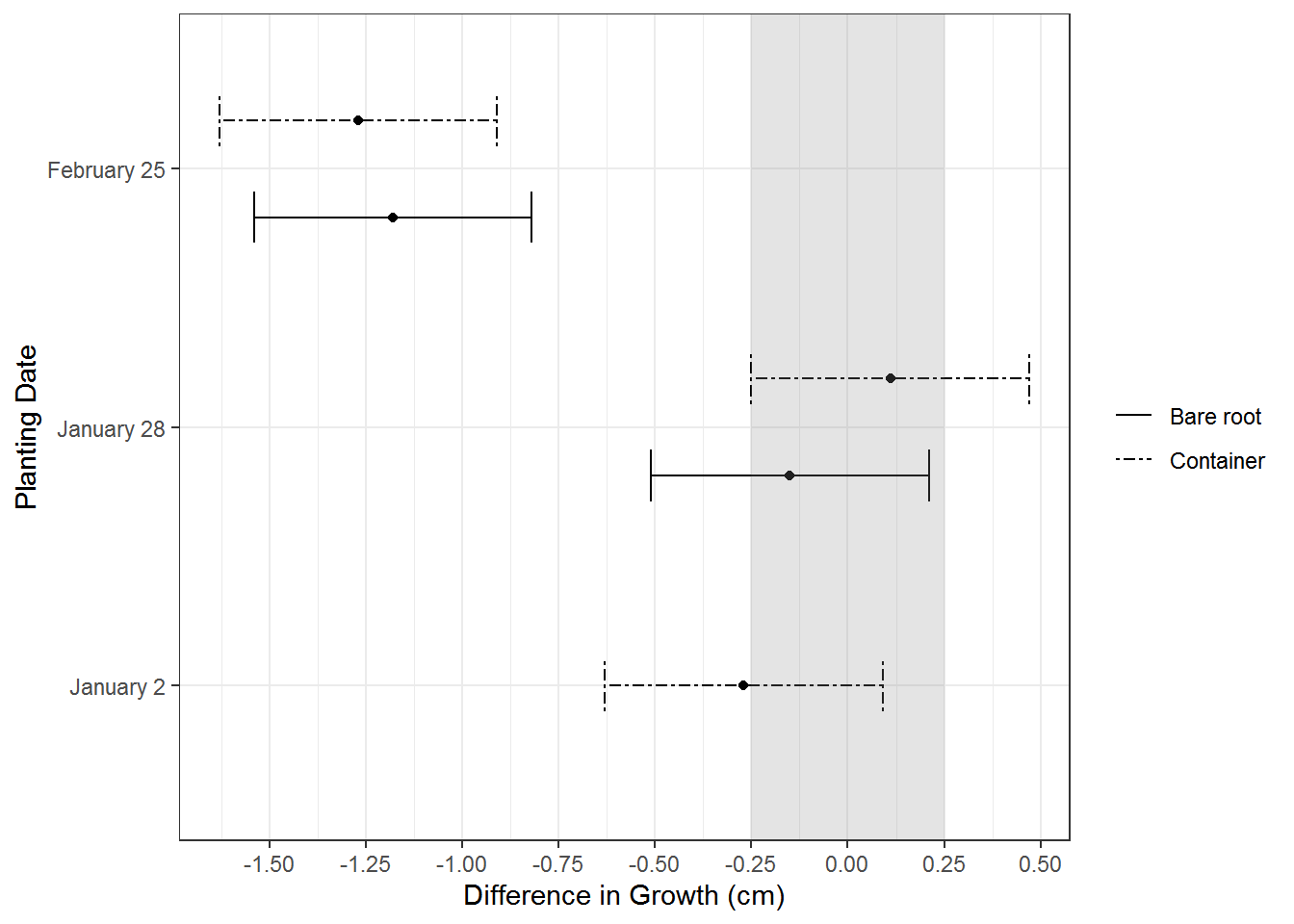
One year I had a student ask a great question about the order of the legend. The order of the lines representing the two groups in the plot is exactly opposite of the order of the groups in the legend. He felt the plot would feel more polished if the group order between the elements matched; I agreed.
Change the data to change the plot?
Now, a lot of time the answer to “how do I change the order of a categorical variable in ggplot2” is change the data to change the plot. (I’ve use forcats::fct_inorder a lot for getting the levels of variables like month names in the correct order for plotting.)
But that doesn’t work in this case. If I change the order of the levels of the factor…
res$stocktype = factor(res$stocktype, levels = c("cont", "bare") )…both the order of the groups in the plot and the legend flip, so they are still exactly opposite of each other.
g1 %+%
     res +
     scale_linetype_manual(values = c("solid", "twodash"),
                            name = element_blank(),
                            labels = c("Container", "Bare root") )
# Scale for 'linetype' is already present. Adding another scale for
# 'linetype', which will replace the existing scale.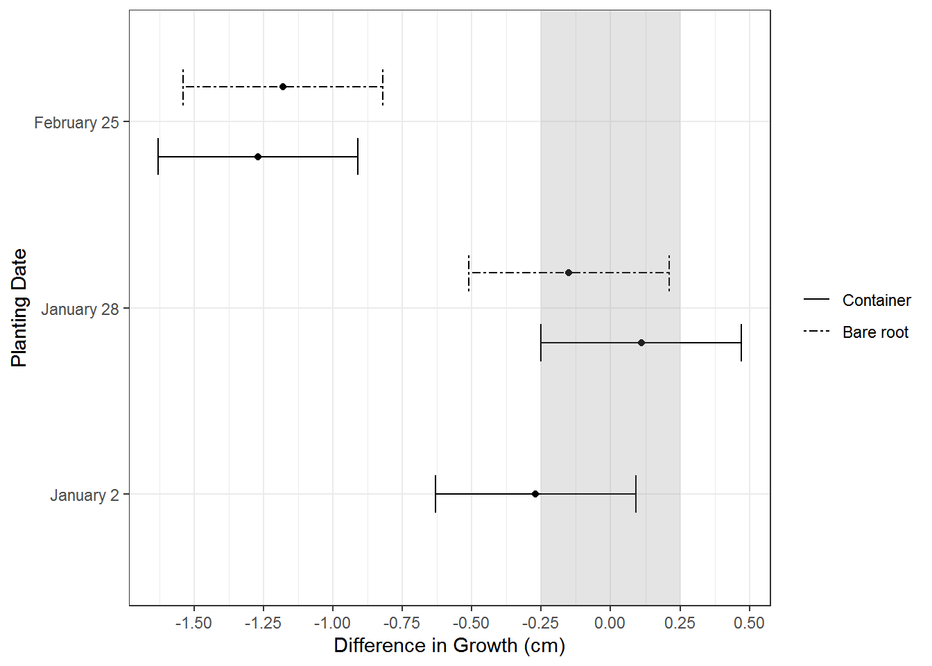
Reverse the legend in guide_legend()
Back to the drawing board (and some time online), it turns out the answer is to reverse the legend within ggplot2. There is a “reverse” argument in the guide_legend() function. This function can be used either inside a scale_*() function with the “guides” argument or within guides().
In this particular case, the scale_linetype_manual() line can be changed to incorporate guide_legend().
Like this:
scale_linetype_manual(values = c("solid", "twodash"),
                      name = element_blank(),
                      labels = c("Container", "Bare root"),
                      guide = guide_legend(reverse = TRUE) )
This works to get the plot order and legend matching in a more aesthetically pleasing way.
g1 %+%
     res +
     scale_linetype_manual(values = c("solid", "twodash"),
                           name = element_blank(),
                           labels = c("Container", "Bare root"),
                           guide = guide_legend(reverse = TRUE) )
It was a good day; everyone got to learn something new! 🎉
Just the code, please
Here’s the code without all the discussion. Copy and paste the code below or you can download an R script of uncommented code from here.
res = structure(list(Diffmeans = c(-0.27, 0.11, -0.15, -1.27, -1.18
), Lower.CI = c(-0.63, -0.25, -0.51, -1.63, -1.54), Upper.CI = c(0.09,
0.47, 0.21, -0.91, -0.82), plantdate = structure(c(1L, 2L, 2L,
3L, 3L), .Label = c("January 2", "January 28", "February 25"), class = "factor"),
    stocktype = structure(c(2L, 2L, 1L, 2L, 1L), .Label = c("bare",
    "cont"), class = "factor")), .Names = c("Diffmeans", "Lower.CI",
"Upper.CI", "plantdate", "stocktype"), row.names = c(NA, -5L), class = "data.frame")

library(ggplot2)

( g1 = ggplot(res, aes(x = plantdate, y = Diffmeans, group = stocktype) ) +
    geom_point(position = position_dodge(width = .75) ) +
    geom_errorbar( aes(ymin = Lower.CI, ymax = Upper.CI,
                       linetype = stocktype,
                       width = c(.2, .4, .4, .4, .4) ),
                   position = position_dodge(width = .75) ) +
      theme_bw() +
      labs(y = "Difference in Growth (cm)",
           x = "Planting Date") +
      geom_rect(xmin = -Inf, xmax = Inf, ymin = -.25, ymax = .25,
            fill = "grey54", alpha = .05) +
      scale_y_continuous(breaks = seq(-1.5, .5, by = .25) ) +
      coord_flip() +
      scale_linetype_manual(values = c("solid", "twodash"),
                            name = element_blank(),
                            labels = c("Bare root", "Container") ) )

res$stocktype = factor(res$stocktype, levels = c("cont", "bare") )

g1 %+%
     res +
     scale_linetype_manual(values = c("solid", "twodash"),
                            name = element_blank(),
                            labels = c("Container", "Bare root") )

g1 %+%
     res +
     scale_linetype_manual(values = c("solid", "twodash"),
                           name = element_blank(),
                           labels = c("Container", "Bare root"),
                           guide = guide_legend(reverse = TRUE) )