How to plot fitted lines with ggplot2
Most analyses aren’t really done until we’ve found a way to visualize the results graphically, and I’ve recently been getting some questions from students on how to plot fitted lines from models. There are some R packages that are made specifically for this purpose; see packages effects and visreg, for example.
If using the ggplot2 package for plotting, fitted lines from simple models can be graphed using geom_smooth(). However, once models get more complicated that convenient function is no longer useful. I’ll go over the approach that I use for plotting fitted lines in ggplot2 that can be used across many model types and situations.
Table of Contents
- Load packages and dataset
- Plotting separate slopes with geom_smooth()
- Extracting predicted values with predict()
- Plotting predicted values with geom_line()
- Add confidence intervals for lm objects
- Using a new dataset with predict()
- Plotting fitted lines from an lme object
- Confidence intervals for lme objects
- What if there is no predict() function?
- Just the code, please
Load packages and dataset
First I’ll load the packages I’m using today.
library(nlme) # v. 3.1-137
library(ggplot2) # v. 3.1.0
I’m going to set the ggplot2 theme to theme_bw().
theme_set(theme_bw())I created a dataset to use for fitting models and used dput() to copy and paste it here.
dat = structure(list(block = structure(c(1L, 1L, 1L, 1L, 2L, 2L, 2L,
2L, 3L, 3L, 3L, 3L, 4L, 4L, 4L, 4L, 5L, 5L, 5L, 5L, 6L, 6L, 6L,
6L, 7L, 7L, 7L, 7L, 8L, 8L, 8L, 8L, 9L, 9L, 9L, 9L, 10L, 10L,
10L, 10L), .Label = c("A", "B", "C", "D", "E", "F", "G", "H",
"I", "J"), class = "factor"), grp = structure(c(1L, 2L, 3L,
4L, 1L, 2L, 3L, 4L, 1L, 2L, 3L, 4L, 1L, 2L, 3L, 4L, 1L, 2L, 3L,
4L, 1L, 2L, 3L, 4L, 1L, 2L, 3L, 4L, 1L, 2L, 3L, 4L, 1L, 2L, 3L,
4L, 1L, 2L, 3L, 4L), .Label = c("a", "b", "c", "d"), class = "factor"),
    x1 = c(11.1, 7.9, 6.6, 7.1, 10.6, 8, 9.8, 8.2, 9.5, 5.4,
    15, 15.3, 10.4, 5.5, 9.1, 15.3, 12.9, 9.9, 5, 7.4, 10.4,
    8.2, 14.1, 4.7, 11.9, 12.5, 8.7, 7, 5.5, 5.7, 13.7, 11.8,
    7, 14.8, 4.9, 14.3, 7.8, 15.4, 15.2, 12.2), x2 = c(109.9,
    149.2, 187.4, 124.1, 190.7, 145, 110.1, 114.1, 119.9, 163.8,
    192.7, 158.3, 180.5, 127.7, 133.1, 137.5, 167.8, 181.8, 156.4,
    109.7, 143.9, 194.2, 139.1, 112.4, 194, 125.7, 127, 149.1,
    117.8, 170.4, 167.3, 101.1, 128, 157.8, 139.7, 193.6, 121.1,
    161.1, 112, 137.3), resp = c(86.5, 63.1, 10.5, 44.4, 61.9,
    67.7, 64.1, 59.4, 66.1, 33.2, 91.6, 116.4, 59.4, 38.6, 44.6,
    122.9, 87.1, 75.1, -0.8, 49.1, 70.2, 57.8, 96.4, 22.5, 74.7,
    116.7, 46, 39.8, 28.3, 34.1, 87, 97.1, 37.3, 126.8, 2.2,
    96.1, 45.3, 131.9, 107.6, 92.7)), class = "data.frame", row.names = c(NA,
-40L))
This dataset has one response variable, resp, along with two continuous (x1, x2) and one categorical (grp) explanatory variables. These data are from a blocked design, and the block variable is available to be used as a random effect.
head(dat)# block grp x1 x2 resp
# 1 A a 11.1 109.9 86.5
# 2 A b 7.9 149.2 63.1
# 3 A c 6.6 187.4 10.5
# 4 A d 7.1 124.1 44.4
# 5 B a 10.6 190.7 61.9
# 6 B b 8.0 145.0 67.7Plotting separate slopes with geom_smooth()
The geom_smooth() function in ggplot2 can plot fitted lines from models with a simple structure. Supported model types include models fit with lm(), glm(), nls(), and mgcv::gam().
Fitted lines can vary by groups if a factor variable is mapped to an aesthetic like color or group. I’m going to plot fitted regression lines of resp vs x1 for each grp category.
By default you will get confidence intervals plotted in geom_smooth(). This can be great if you are plotting the results after you’ve checked all assumptions but is not-so-great if you are exploring the data. Confidence intervals can be suppressed using se = FALSE, which I use below.
This is a linear model fit, so I use method = "lm".
ggplot(dat, aes(x = x1, y = resp, color = grp) ) +
     geom_point() +
     geom_smooth(method = "lm", se = FALSE)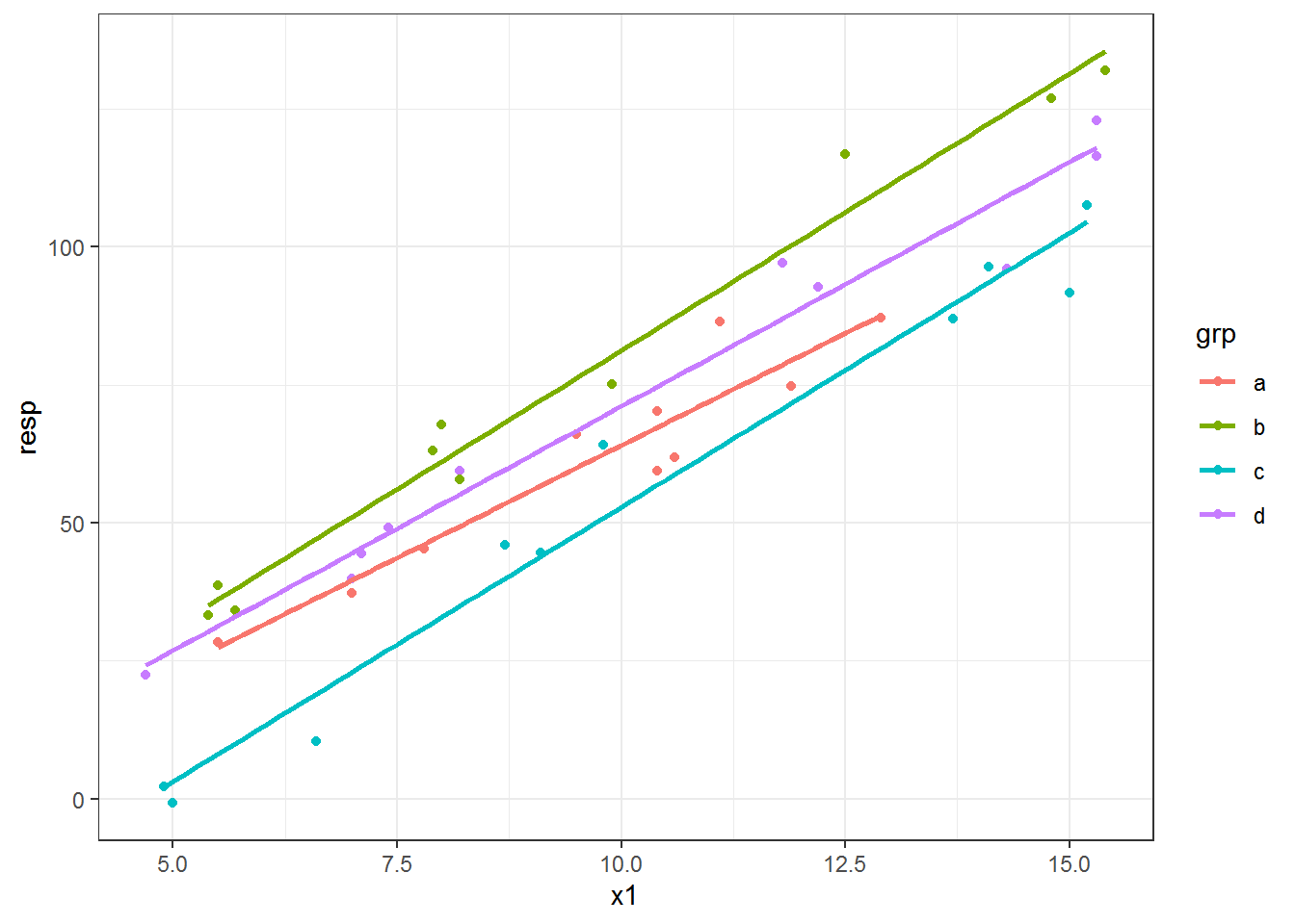
Here is the same plot with a 95% confidence envelope (the default interval size) as a ribbon around the fitted lines. I used fill to make the ribbons the same color as the lines. I increased the transparency of the ribbons by decreasing alpha, as well, since adding confidence ribbons for many fitted lines in one plot can end up looking pretty messy.
ggplot(dat, aes(x = x1, y = resp, color = grp) ) +
     geom_point() +
     geom_smooth(method = "lm", alpha = .15, aes(fill = grp))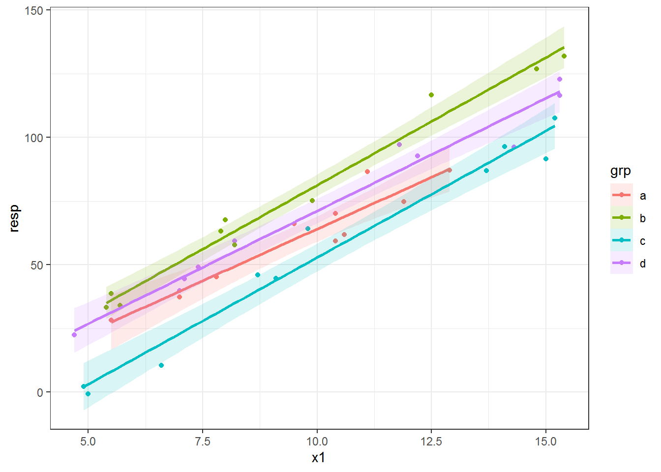
Extracting predicted values with predict()
In the plots above you can see that the slopes vary by grp category. If you want parallel lines instead of separate slopes per group, geom_smooth() isn’t going to work for you.
To free ourselves of the constraints of geom_smooth(), we can take a different plotting approach. We can instead fit a model and extract the predicted values. These predicted values can then be used for drawing the fitted line(s). For many model types the predictions can be extracted from the fitted model via the predict() function.
You can check if the model you are using has a predict function via methods(). For example, methods("predict") lists all the different model objects that have specific predict() functions. Since I’ve already loaded package nlme you can see predict.lme and predict.gls along with many others. (Also see, e.g., methods(class = "lm") for functions available for a specific model type.)
methods("predict")# [1] predict.ar* predict.Arima*
# [3] predict.arima0* predict.glm
# [5] predict.gls* predict.gnls*
# [7] predict.HoltWinters* predict.lm
# [9] predict.lme* predict.lmList*
# [11] predict.loess* predict.mlm*
# [13] predict.nlme* predict.nls*
# [15] predict.poly* predict.ppr*
# [17] predict.prcomp* predict.princomp*
# [19] predict.smooth.spline* predict.smooth.spline.fit*
# [21] predict.StructTS*
# see '?methods' for accessing help and source codeYou can go to the help page for the predict() function for a specific model type. For example, ?predict.lme will take you to the documentation for the predict() function for lme objects fit with nlme::lme().
Plotting predicted values with geom_line()
The first step of this “prediction” approach to plotting fitted lines is to fit a model. I’ll use a linear model with a different intercept for each grp category and a single x1 slope to end up with parallel lines per group.
fitlm = lm(resp ~ grp + x1, data = dat)I can add the predicted values to the dataset.
dat$predlm = predict(fitlm)And then use these in geom_line() to add fitted lines based on the new predlm variable.
ggplot(dat, aes(x = x1, y = resp, color = grp) ) +
     geom_point() +
     geom_line(aes(y = predlm), size = 1)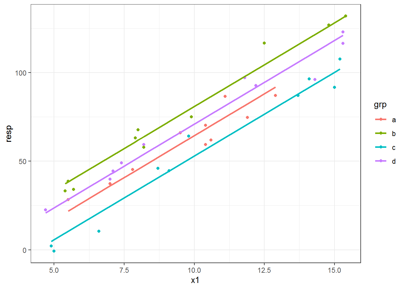
Add confidence intervals for lm objects
What about confidence intervals? The predict() function for lm objects has an interval argument that returns confidence or prediction intervals, which are appropriate to use if model assumptions have been reasonably met. I’m skipping the assumption-checking step here. 😉
Adding interval = "confidence" returns a three column matrix, where fit contains the fitted values and lwr and upr contain the lower and upper confidence interval limits of the predicted values, respectively. I used the default and so get a 95% confidence interval for each predicted value.
predslm = predict(fitlm, interval = "confidence")
head(predslm)
# fit lwr upr
# 1 74.81834 70.34137 79.29530
# 2 60.98358 56.50132 65.46584
# 3 20.79813 15.82711 25.76916
# 4 43.50991 38.65007 48.36975
# 5 70.09232 65.66922 74.51542
# 6 61.92879 57.45949 66.39808These columns can be bound to dat for plotting.
datlm = cbind(dat, predslm)
head(datlm)
# block grp x1 x2 resp predlm fit lwr upr
# 1 A a 11.1 109.9 86.5 74.81834 74.81834 70.34137 79.29530
# 2 A b 7.9 149.2 63.1 60.98358 60.98358 56.50132 65.46584
# 3 A c 6.6 187.4 10.5 20.79813 20.79813 15.82711 25.76916
# 4 A d 7.1 124.1 44.4 43.50991 43.50991 38.65007 48.36975
# 5 B a 10.6 190.7 61.9 70.09232 70.09232 65.66922 74.51542
# 6 B b 8.0 145.0 67.7 61.92879 61.92879 57.45949 66.39808Now we can plot the lines using geom_line() and add a confidence envelope via geom_ribbon(). Note I have to use an alpha value less than 1 to make the ribbon transparent. I put the ribbon layer before the line in the plot so the line is drawn on top of the ribbon.
The color aesthetic affects the ribbon outline, which I didn’t really like. I used color = NULL to remove the outlines all together and then mapped the grp variable to the fill aesthetic. If I wanted gray ribbons instead I could have used the group aesthetic in place of fill.
ggplot(datlm, aes(x = x1, y = resp, color = grp) ) +
     geom_point() +
     geom_ribbon( aes(ymin = lwr, ymax = upr, fill = grp, color = NULL), alpha = .15) +
     geom_line( aes(y = fit), size = 1)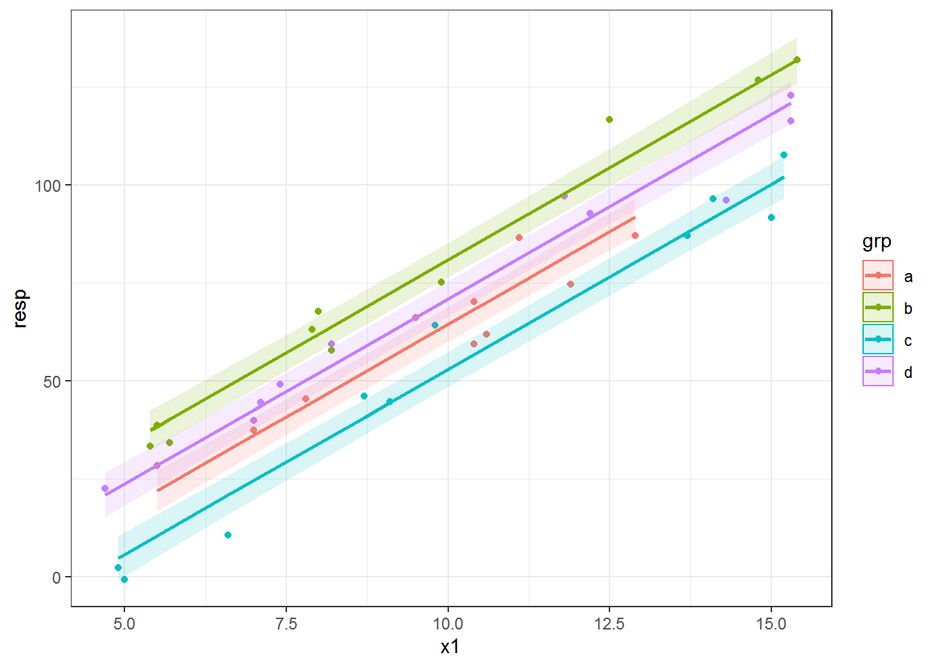
Using a new dataset with predict()
The fitted lines in all the plots so far are different lengths. This is because we have slightly different ranges of x1 for each grp category in the dataset. By default when using predict() we get the fitted values; i.e., the predicted values from the dataset used in model fitting.
I think having different line lengths is fine here, but there are times when we want to draw each line across the entire range of the variable in the dataset. Also, sometimes our data are so sparse that our fitted line ends up not being very smooth; this can be especially problematic for non-linear fits. In both of these situations we’d want to make a new dataset for making the predictions.
Let’s make group lines using the entire range of x1 instead of the within-group range. We can make a variable with the full range of x1 via seq(), making a sequence from the minimum to maximum dataset value. I use 0.1 as the increment in seq(); the increment value you’ll want to use depends on the range of your variable.
head( seq(min(dat$x1), max(dat$x1), by = .1) )# [1] 4.7 4.8 4.9 5.0 5.1 5.2Then to get this full range x1 associated with each grp category we can use expand.grid().
newdat = expand.grid(x1 = seq(min(dat$x1), max(dat$x1), by = .1),
                     grp = unique(dat$grp) )
The key to making a dataset for prediction is that it must have every variable used in the model in it. You will get an error if you forget a variable or make a typo in one of the variable names. Note that the prediction dataset does not need to contain the response variable.
We use this prediction dataset with the newdata argument in predict(). I’ll add the predicted values as a new variable to the prediction dataset.
newdat$predlm = predict(fitlm, newdata = newdat)When we make the plot of the fitted lines now we can see that the line for each group covers the same range. There are now two datasets used in the plotting code: the original for the points and newdat within geom_line().
ggplot(dat, aes(x = x1, y = resp, color = grp) ) +
     geom_point() +
     geom_line(data = newdat, aes(y = predlm), size = 1)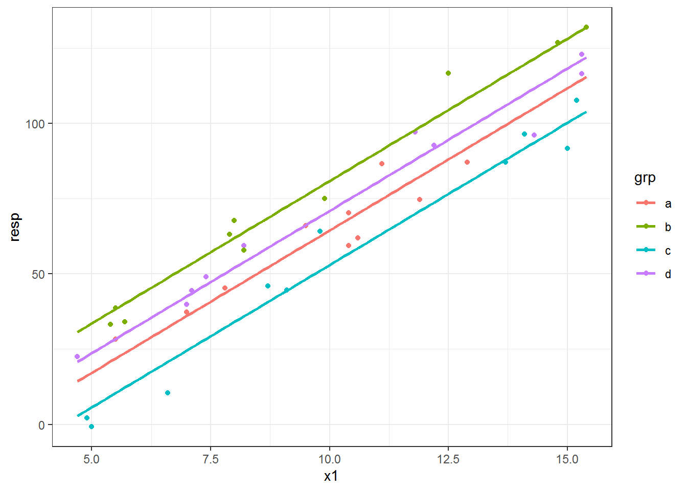
Plotting fitted lines from an lme object
The approach I demonstrated above, where the predicted values are extracted and used for plotting the fitted lines, works across many model types and is the general approach I use for most fitted line plotting I do in ggplot2.
I’ll show one more example, this time using the “real” model. 😀 This is the model that I used to create resp. The model is a linear mixed model with all three explanatory variables as additive fixed effects (no interactions) along with the random effect of block.
fitlme = lme(resp ~ grp + x1 + x2,
             random = ~1|block,
             data = dat)
We can make predictions via the predict() function for lme objects. However, since I have two continuous explanatory variables I’ll have to do this for one variable while holding the other fixed. This is called an added variable plot, which I’ve written about before.
I’ll focus on making a plot for x1 while holding x2 at its median. I’m going to make a new dataset for prediction since x2 will be a constant.
I could make a sequence for x1 like I did above, but instead I simply pull grp and x1 from the original dataset. Since I don’t want to use the random effect in my predictions I do not include block in this prediction dataset.
newdat.lme = data.frame(grp = dat$grp,
                        x1 = dat$x1,
                        x2 = median(dat$x2) )
head(newdat.lme)
# grp x1 x2
# 1 a 11.1 141.8
# 2 b 7.9 141.8
# 3 c 6.6 141.8
# 4 d 7.1 141.8
# 5 a 10.6 141.8
# 6 b 8.0 141.8I use level = 0 in predict() to get the marginal or population predictions (this is equivalent to re.form = NA for lme4 models). See ?predict.lme for more info.
If I wanted to make conditional predictions, block would need to be part of newdat.lme. Conditional predictions would not get you nice straight lines for the overall fixed effects. 😜
newdat.lme$predlme = predict(fitlme, newdata = newdat.lme, level = 0)Since this is an added variable plot (from a model with multiple continuous variables), it doesn’t make a lot of sense to plot the line directly on top of the raw data points. I switch to using a rug plot for the x axis so we can see where we have data.
ggplot(dat, aes(x = x1, y = resp, color = grp) ) +
     geom_rug(sides = "b", size = 1) +
     geom_line(data = newdat.lme, aes(y = predlme), size = 1)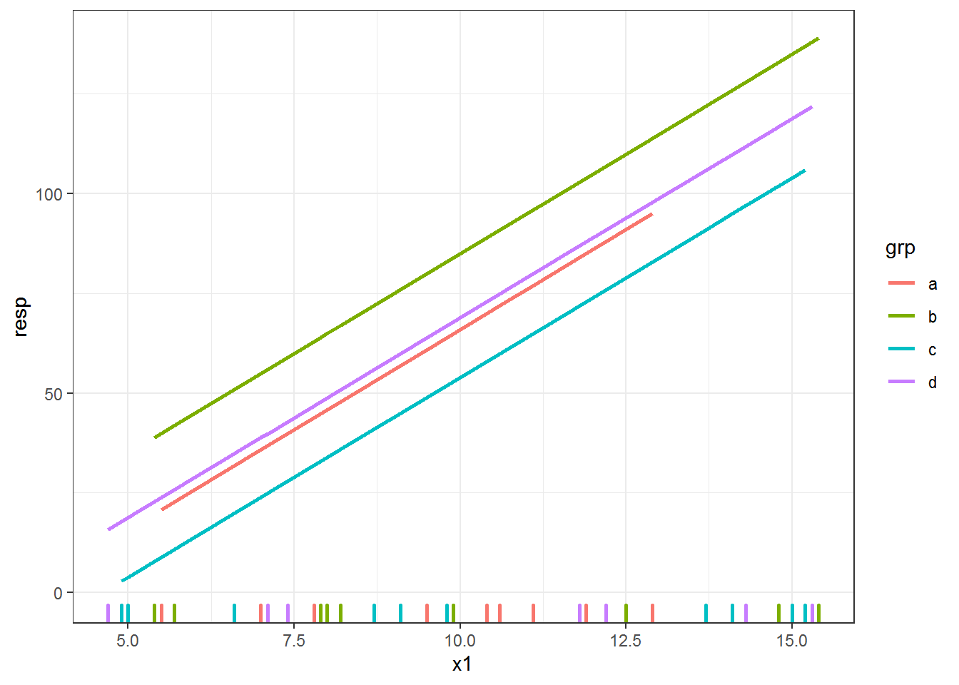
Confidence intervals for lme objects
What if we wanted to add a confidence envelope? You’ll see predict.lme does not have an option to get confidence intervals or calculate standard errors that could be used to build confidence intervals. I use the recipe from the GLMM FAQ maintained by Ben Bolker, although this approach does not take the uncertainty of the random effects into account.
This approach involves getting the model matrix \(X\), the covariance matrix of the parameters \(V\), and calculating \(XVX'\).
First we get the model matrix using the prediction dataset. The code looks extra complicated because we don’t have resp in the prediction dataset.
des = model.matrix(formula(fitlme)[-2], newdat.lme)Then we use matrix multiplication on the model matrix and variance-covariance matrix extracted from the model with vcov(). We pull out the values on the diagonal, which are the variances of the predicted values.
predvar = diag( des %*% vcov(fitlme) %*% t(des) )To construct approximate confidence intervals we can use the standard errors (square root of predvar) along with an appropriate multiplier. I’m using 2 as a multiplier, but you could also figure out the appropriate \(t\) multiplier based on the degrees of freedom or use 1.96 as a \(z\) multiplier.
I add the confidence interval limits to the dataset for plotting.
newdat.lme$lower = with(newdat.lme, predlme - 2*sqrt(predvar) )
newdat.lme$upper = with(newdat.lme, predlme + 2*sqrt(predvar) )
Here’s the plot, with a (very small!) confidence envelope for each line.
ggplot(dat, aes(x = x1, y = resp, color = grp) ) +
     geom_rug(sides = "b", size = 1) +
     geom_ribbon(data = newdat.lme, aes(y = NULL, ymin = lower, ymax = upper,
                                        color = NULL, fill = grp),
                 alpha = .15) +
          geom_line(data = newdat.lme, aes(y = predlme), size = .75)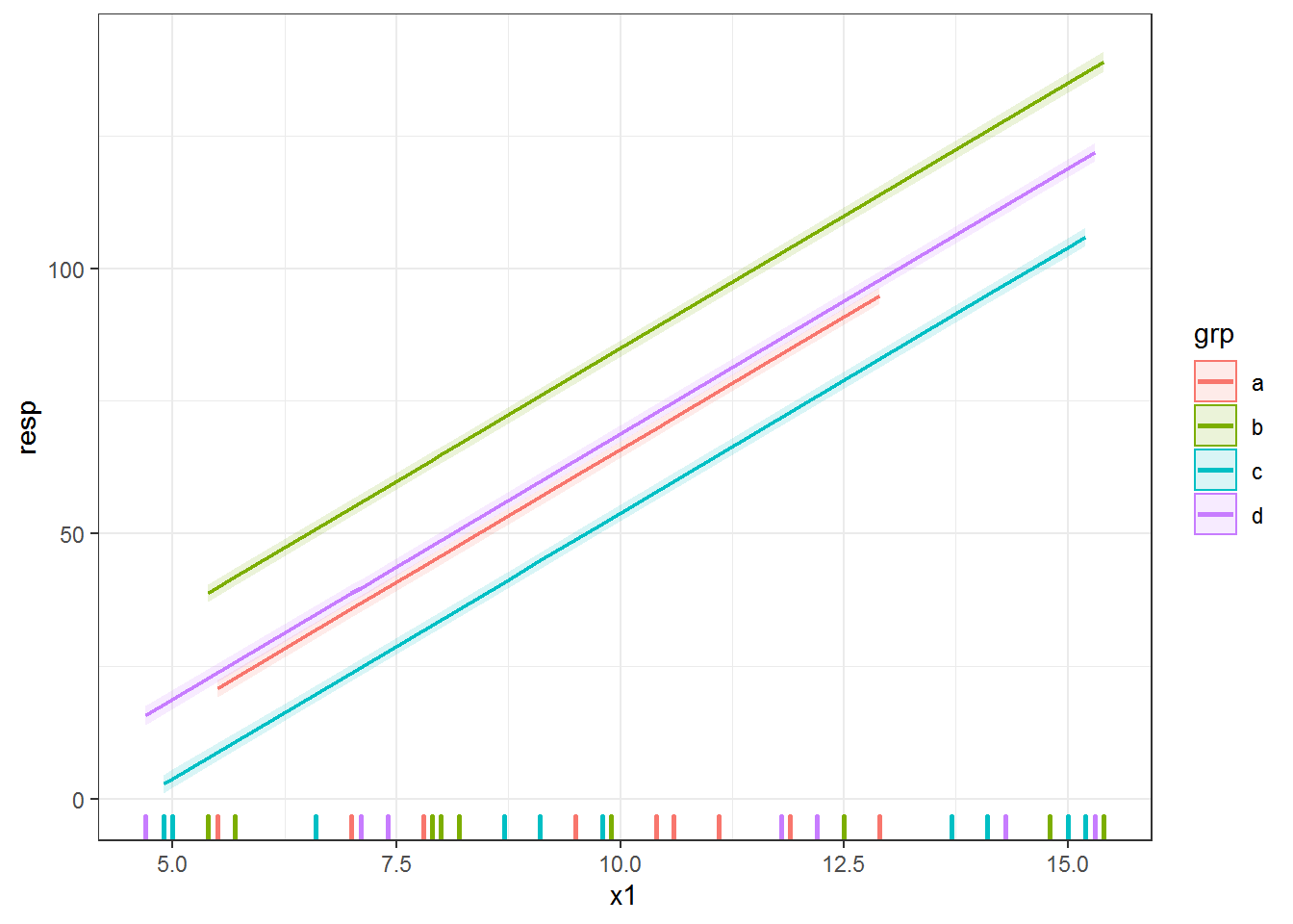
What if there is no predict() function?
In my experience, the vast majority of modeling packages these days have predict() functions. If the one you are using doesn’t, though, you can usually do your own predictions with matrix multiplication of the model matrix and the fixed effects. You can see an example for the glmmADMB package from the GLMM FAQ here.
Just the code, please
Here’s the code without all the discussion. Copy and paste the code below or you can download an R script of uncommented code from here.
library(nlme) # v. 3.1-137
library(ggplot2) # v. 3.1.0

theme_set(theme_bw())

dat = structure(list(block = structure(c(1L, 1L, 1L, 1L, 2L, 2L, 2L,
2L, 3L, 3L, 3L, 3L, 4L, 4L, 4L, 4L, 5L, 5L, 5L, 5L, 6L, 6L, 6L,
6L, 7L, 7L, 7L, 7L, 8L, 8L, 8L, 8L, 9L, 9L, 9L, 9L, 10L, 10L,
10L, 10L), .Label = c("A", "B", "C", "D", "E", "F", "G", "H",
"I", "J"), class = "factor"), grp = structure(c(1L, 2L, 3L,
4L, 1L, 2L, 3L, 4L, 1L, 2L, 3L, 4L, 1L, 2L, 3L, 4L, 1L, 2L, 3L,
4L, 1L, 2L, 3L, 4L, 1L, 2L, 3L, 4L, 1L, 2L, 3L, 4L, 1L, 2L, 3L,
4L, 1L, 2L, 3L, 4L), .Label = c("a", "b", "c", "d"), class = "factor"),
    x1 = c(11.1, 7.9, 6.6, 7.1, 10.6, 8, 9.8, 8.2, 9.5, 5.4,
    15, 15.3, 10.4, 5.5, 9.1, 15.3, 12.9, 9.9, 5, 7.4, 10.4,
    8.2, 14.1, 4.7, 11.9, 12.5, 8.7, 7, 5.5, 5.7, 13.7, 11.8,
    7, 14.8, 4.9, 14.3, 7.8, 15.4, 15.2, 12.2), x2 = c(109.9,
    149.2, 187.4, 124.1, 190.7, 145, 110.1, 114.1, 119.9, 163.8,
    192.7, 158.3, 180.5, 127.7, 133.1, 137.5, 167.8, 181.8, 156.4,
    109.7, 143.9, 194.2, 139.1, 112.4, 194, 125.7, 127, 149.1,
    117.8, 170.4, 167.3, 101.1, 128, 157.8, 139.7, 193.6, 121.1,
    161.1, 112, 137.3), resp = c(86.5, 63.1, 10.5, 44.4, 61.9,
    67.7, 64.1, 59.4, 66.1, 33.2, 91.6, 116.4, 59.4, 38.6, 44.6,
    122.9, 87.1, 75.1, -0.8, 49.1, 70.2, 57.8, 96.4, 22.5, 74.7,
    116.7, 46, 39.8, 28.3, 34.1, 87, 97.1, 37.3, 126.8, 2.2,
    96.1, 45.3, 131.9, 107.6, 92.7)), class = "data.frame", row.names = c(NA,
-40L))
head(dat)

ggplot(dat, aes(x = x1, y = resp, color = grp) ) +
     geom_point() +
     geom_smooth(method = "lm", se = FALSE)

ggplot(dat, aes(x = x1, y = resp, color = grp) ) +
     geom_point() +
     geom_smooth(method = "lm", alpha = .15, aes(fill = grp))

methods("predict")

fitlm = lm(resp ~ grp + x1, data = dat)
dat$predlm = predict(fitlm)

ggplot(dat, aes(x = x1, y = resp, color = grp) ) +
     geom_point() +
     geom_line(aes(y = predlm), size = 1)

predslm = predict(fitlm, interval = "confidence")
head(predslm)

datlm = cbind(dat, predslm)
head(datlm)

ggplot(datlm, aes(x = x1, y = resp, color = grp) ) +
     geom_point() +
     geom_ribbon( aes(ymin = lwr, ymax = upr, fill = grp, color = NULL), alpha = .15) +
     geom_line( aes(y = fit), size = 1)

head( seq(min(dat$x1), max(dat$x1), by = .1) )

newdat = expand.grid(x1 = seq(min(dat$x1), max(dat$x1), by = .1),
                     grp = unique(dat$grp) )

newdat$predlm = predict(fitlm, newdata = newdat)

ggplot(dat, aes(x = x1, y = resp, color = grp) ) +
     geom_point() +
     geom_line(data = newdat, aes(y = predlm), size = 1)

fitlme = lme(resp ~ grp + x1 + x2,
             random = ~1|block,
             data = dat)

newdat.lme = data.frame(grp = dat$grp,
                        x1 = dat$x1,
                        x2 = median(dat$x2) )
head(newdat.lme)

newdat.lme$predlme = predict(fitlme, newdata = newdat.lme, level = 0)

ggplot(dat, aes(x = x1, y = resp, color = grp) ) +
     geom_rug(sides = "b", size = 1) +
     geom_line(data = newdat.lme, aes(y = predlme), size = 1)

des = model.matrix(formula(fitlme)[-2], newdat.lme)

predvar = diag( des %*% vcov(fitlme) %*% t(des) )

newdat.lme$lower = with(newdat.lme, predlme - 2*sqrt(predvar) )
newdat.lme$upper = with(newdat.lme, predlme + 2*sqrt(predvar) )

ggplot(dat, aes(x = x1, y = resp, color = grp) ) +
     geom_rug(sides = "b", size = 1) +
     geom_ribbon(data = newdat.lme, aes(y = NULL, ymin = lower, ymax = upper,
                                        color = NULL, fill = grp),
                 alpha = .15) +
          geom_line(data = newdat.lme, aes(y = predlme), size = .75)