Embedding subplots in ggplot2 graphics
The idea of embedded plots for visualizing a large dataset that has an overplotting problem recently came up in some discussions with students. I first learned about embedded graphics from package ggsubplot. You can still see an old post about that package and about embedded graphics in general, with examples. However, ggsubplot is no longer maintained and doesn’t work with current versions of ggplot2.
I poked around a bit, and found that annotation_custom() is the go-to function for embedding plots in a ggplot2 graphic. I found a couple of recent examples for how to tackle making such plots on Stack Overflow here and here.
I’m going to work through an example of embedding subplots using the same kind of looping approach outlined in those answers.
Table of Contents
- R packages
- Cutting continuous variables into evenly-spaced categories
- Categorizing the axis variables
- Extracting the coordinates for each subplot
- Bar plot subplots
- Creating all the bar plot subplots
- Putting the subplots into annotation_custom()
- Making the large plot
- Embedding the bar plot subplots
- Histogram subplots
- Get the histograms ready to embed
- Embed the histogram subplots
- A density subplot example
- Filled density plots
- Just the code, please
R packages
First I’ll load the R packages I’m using today. All plotting is done via ggplot2, I do data manipulation with dplyr and tidyr, and purrr is for looping to make the subplots and then for getting the subplots into annotation_custom() layers.
library(ggplot2) # 3.1.1
suppressPackageStartupMessages( library(dplyr) ) # 0.8.0.1
library(tidyr) # 0.8.3
library(purrr) # 0.3.2
Cutting continuous variables into evenly-spaced categories
Binning the continuous variables that will be on the axes of the larger plot in order to create separate datasets for each subplot is the first step in this process.
I thought it made the most sense to make all the subplots the same size in the final plot and so I wanted to make evenly sized bins or groups. The range of values in each bin can then be based on the total range of the variable of interest and the desired number of groups.
Binning into even-length groups is a job for cut(). I’m going to need the minimum and maximum value of each group to place the subplots along the axes of the larger plot, so rather than using cut() directly I made a function built around it. While information on the range of values encompassed by a group can be pulled from the default cut() bin labels, I didn’t like how cut() rounded those values.
My function, cuteven(), takes a continuous variable and returns a variable cut into ngroups bins. The labels for the new groups are the unrounded minimum and maximum value within each group, with the values separated by commas.
I use include.lowest = TRUE in cut() is to make sure the minimum value in the dataset is included in the first group.
cuteven = function(variable, ngroups) {
     seq_all = seq(min(variable), max(variable), length.out = ngroups + 1)
     cut(variable,
         breaks = seq_all,
         labels = paste(seq_all[-(ngroups + 1)], seq_all[-1], sep = ","),
         include.lowest = TRUE)
}
I’ll test the function by cutting Sepal.Length from the iris dataset into 3 groups. The new, categorical variable has three groups. The groups are labeled with their minimum and maximum value.
with(iris, cuteven(Sepal.Length, ngroups = 3) )# [1] 4.3,5.5 4.3,5.5 4.3,5.5 4.3,5.5 4.3,5.5 4.3,5.5 4.3,5.5 4.3,5.5
# [9] 4.3,5.5 4.3,5.5 4.3,5.5 4.3,5.5 4.3,5.5 4.3,5.5 5.5,6.7 5.5,6.7
# [17] 4.3,5.5 4.3,5.5 5.5,6.7 4.3,5.5 4.3,5.5 4.3,5.5 4.3,5.5 4.3,5.5
# [25] 4.3,5.5 4.3,5.5 4.3,5.5 4.3,5.5 4.3,5.5 4.3,5.5 4.3,5.5 4.3,5.5
# [33] 4.3,5.5 4.3,5.5 4.3,5.5 4.3,5.5 4.3,5.5 4.3,5.5 4.3,5.5 4.3,5.5
# [41] 4.3,5.5 4.3,5.5 4.3,5.5 4.3,5.5 4.3,5.5 4.3,5.5 4.3,5.5 4.3,5.5
# [49] 4.3,5.5 4.3,5.5 6.7,7.9 5.5,6.7 6.7,7.9 4.3,5.5 5.5,6.7 5.5,6.7
# [57] 5.5,6.7 4.3,5.5 5.5,6.7 4.3,5.5 4.3,5.5 5.5,6.7 5.5,6.7 5.5,6.7
# [65] 5.5,6.7 5.5,6.7 5.5,6.7 5.5,6.7 5.5,6.7 5.5,6.7 5.5,6.7 5.5,6.7
# [73] 5.5,6.7 5.5,6.7 5.5,6.7 5.5,6.7 6.7,7.9 5.5,6.7 5.5,6.7 5.5,6.7
# [81] 4.3,5.5 4.3,5.5 5.5,6.7 5.5,6.7 4.3,5.5 5.5,6.7 5.5,6.7 5.5,6.7
# [89] 5.5,6.7 4.3,5.5 4.3,5.5 5.5,6.7 5.5,6.7 4.3,5.5 5.5,6.7 5.5,6.7
# [97] 5.5,6.7 5.5,6.7 4.3,5.5 5.5,6.7 5.5,6.7 5.5,6.7 6.7,7.9 5.5,6.7
# [105] 5.5,6.7 6.7,7.9 4.3,5.5 6.7,7.9 5.5,6.7 6.7,7.9 5.5,6.7 5.5,6.7
# [113] 6.7,7.9 5.5,6.7 5.5,6.7 5.5,6.7 5.5,6.7 6.7,7.9 6.7,7.9 5.5,6.7
# [121] 6.7,7.9 5.5,6.7 6.7,7.9 5.5,6.7 5.5,6.7 6.7,7.9 5.5,6.7 5.5,6.7
# [129] 5.5,6.7 6.7,7.9 6.7,7.9 6.7,7.9 5.5,6.7 5.5,6.7 5.5,6.7 6.7,7.9
# [137] 5.5,6.7 5.5,6.7 5.5,6.7 6.7,7.9 5.5,6.7 6.7,7.9 5.5,6.7 6.7,7.9
# [145] 5.5,6.7 5.5,6.7 5.5,6.7 5.5,6.7 5.5,6.7 5.5,6.7
# Levels: 4.3,5.5 5.5,6.7 6.7,7.9Categorizing the axis variables
While these embedded plots can be useful for large datasets, I’m going demonstrate the process on a relatively small dataset. Here I will embed subplots on a larger plot based on the iris data. The variable Sepal.Length will be on the x axis and Petal.Length on the y axis.
My first step is to categorize those variables with cuteven(). I’m going to make three groups for Sepal.Length and four groups for Petal.Length.
I cut both variables within mutate() and add them to iris. I give the new variables generic names that indicate which variable is on the x axis and which on the y.
iris = mutate(iris,
                group_x = cuteven(Sepal.Length, 3),
                group_y = cuteven(Petal.Length, 4) )

glimpse(iris)
# Observations: 150
# Variables: 7
# $ Sepal.Length <dbl> 5.1, 4.9, 4.7, 4.6, 5.0, 5.4, 4.6, 5.0, 4.4, 4.9,...
# $ Sepal.Width <dbl> 3.5, 3.0, 3.2, 3.1, 3.6, 3.9, 3.4, 3.4, 2.9, 3.1,...
# $ Petal.Length <dbl> 1.4, 1.4, 1.3, 1.5, 1.4, 1.7, 1.4, 1.5, 1.4, 1.5,...
# $ Petal.Width <dbl> 0.2, 0.2, 0.2, 0.2, 0.2, 0.4, 0.3, 0.2, 0.2, 0.1,...
# $ Species <fct> setosa, setosa, setosa, setosa, setosa, setosa, s...
# $ group_x <fct> "4.3,5.5", "4.3,5.5", "4.3,5.5", "4.3,5.5", "4.3,...
# $ group_y <fct> "1,2.475", "1,2.475", "1,2.475", "1,2.475", "1,2....Extracting the coordinates for each subplot
I need the minimum and maximum value per group for each axis variable in order to place the subplot in the larger plot with annotation_custom(). Since the labels of the new variables contain this info separated by a comma, I can use separate() to extract the coordinate information from the labels into separate columns.
Since I have two group variables, one for each axis, I end up using separate() twice. I again make the names of the new columns in into based on which axis I’ll be plotting that variable on.
When this step is complete I’ll have coordinates to indicate where each corner of a subplot will be placed within the larger plot. Unique combinations of the four coordinate variables define each group I want to make a subplot for.
iris = iris %>%
     separate(group_x, into = c("min_x", "max_x"),
              sep = ",", convert = TRUE) %>%
     separate(group_y, into = c("min_y", "max_y"),
              sep = ",", convert = TRUE)

glimpse(iris)
# Observations: 150
# Variables: 9
# $ Sepal.Length <dbl> 5.1, 4.9, 4.7, 4.6, 5.0, 5.4, 4.6, 5.0, 4.4, 4.9,...
# $ Sepal.Width <dbl> 3.5, 3.0, 3.2, 3.1, 3.6, 3.9, 3.4, 3.4, 2.9, 3.1,...
# $ Petal.Length <dbl> 1.4, 1.4, 1.3, 1.5, 1.4, 1.7, 1.4, 1.5, 1.4, 1.5,...
# $ Petal.Width <dbl> 0.2, 0.2, 0.2, 0.2, 0.2, 0.4, 0.3, 0.2, 0.2, 0.1,...
# $ Species <fct> setosa, setosa, setosa, setosa, setosa, setosa, s...
# $ min_x <dbl> 4.3, 4.3, 4.3, 4.3, 4.3, 4.3, 4.3, 4.3, 4.3, 4.3,...
# $ max_x <dbl> 5.5, 5.5, 5.5, 5.5, 5.5, 5.5, 5.5, 5.5, 5.5, 5.5,...
# $ min_y <dbl> 1, 1, 1, 1, 1, 1, 1, 1, 1, 1, 1, 1, 1, 1, 1, 1, 1...
# $ max_y <dbl> 2.475, 2.475, 2.475, 2.475, 2.475, 2.475, 2.475, ...Bar plot subplots
Next I’m going to figure out what I want my subplots to look like. I’m going to start with bar plots to count up the number of each species in each group.
Since I will be making many similar plots I’ll create a function to use for the plotting. I always work out what I want the plot to look like on a single subset of the data before making the function.
In this case, I want all the plots to have the same x and y axes. The y axis of my bar plot is based on counts, so I need to calculate the maximum number of species across groups so I can set the upper y axis limit for all plots to that value.
The maximum count is 47, so that will be my upper axis limit. Bar plots start at 0.
iris %>%
     group_by(min_x, max_x, min_y, max_y, Species) %>%
     count() %>%
     ungroup() %>%
     filter(n == max(n) )
# # A tibble: 1 x 6
# min_x max_x min_y max_y Species n
# <dbl> <dbl> <dbl> <dbl> <fct> <int>
# 1 4.3 5.5 1 2.48 setosa 47In case a species is missing from one of the subplot groups I’ll define the limits for the x axis in scale_x_discrete(). This forces each plot to have the same x axis breaks.
I’ll be removing all axis labels, etc., via theme_void() so that the subplots fit nicely into the larger plot. I will add an outline around the plot, though.
I use fill to color the bars by species since there will be no x axis labels on the subplots. I suppress the legend, as well, and will add a legend to the large plot instead.
I set explicit colors in scale_fill_manual() (colors taken from here) so all the subplots will have the same color scheme.
Here is my test plot for one group. This particular group only has one species in it.
ggplot(data = filter(iris, max_x <= 5.5, max_y <= 2.475),
       aes(x = Species, fill = Species) ) +
     geom_bar() +
     theme_void() +
     scale_x_discrete(limits = c("setosa", "versicolor", "virginica") ) +
     scale_fill_manual(values = c("setosa" = "#ED90A4",
                                  "versicolor" = "#ABB150",
                                  "virginica" = "#00C1B2"),
                       guide  = "none") +
     theme(panel.border = element_rect(color = "grey",
                                       fill = "transparent") ) +
     ylim(0, 47)
Once I have the plot worked out for one group I put the code into a function, barfun. In this case the function takes only a dataset, since I’m hard-coding in all the axis variables, limits, etc.
barfun = function(data) {
     ggplot(data = data,
            aes(x = Species, fill = Species) ) +
          geom_bar() +
          theme_void() +
          scale_x_discrete(limits = c("setosa", "versicolor", "virginica") ) +
          scale_fill_manual(values = c("setosa" = "#ED90A4",
                                       "versicolor" = "#ABB150",
                                       "virginica" = "#00C1B2"),
                            guide  = "none") +
          theme(panel.border = element_rect(color = "grey",
                                            fill = "transparent") ) +
          ylim(0, 47)

}
Does this function make the same plot I made manually? Yep. 👍
barfun(data = filter(iris, max_x <= 5.5, max_y <= 2.475) )
Creating all the bar plot subplots
I’m ready to make the subplots!
I’ll loop through each subset of data and plot it with my function.
Since I’m going to need those coordinates for subplot placement later I decided that the most straightforward way to do this is to group by the unique combinations of coordinates and then nest the dataset. When nesting, the data to be plotted for each group is placed in a column called data.
I loop through each dataset in data via map() within mutate(). The new column containing the plots is named subplots.
allplots = iris %>%
     group_by_at( vars( matches("min|max") ) ) %>%
     group_nest() %>%
     mutate(subplots = map(data, barfun) )

allplots
# # A tibble: 9 x 6
# min_x max_x min_y max_y data subplots
# <dbl> <dbl> <dbl> <dbl> <list> <list>
# 1 4.3 5.5 1 2.48 <tibble [47 x 5]> <S3: gg>
# 2 4.3 5.5 2.48 3.95 <tibble [7 x 5]> <S3: gg>
# 3 4.3 5.5 3.95 5.42 <tibble [5 x 5]> <S3: gg>
# 4 5.5 6.7 1 2.48 <tibble [3 x 5]> <S3: gg>
# 5 5.5 6.7 2.48 3.95 <tibble [4 x 5]> <S3: gg>
# 6 5.5 6.7 3.95 5.42 <tibble [51 x 5]> <S3: gg>
# 7 5.5 6.7 5.42 6.9 <tibble [13 x 5]> <S3: gg>
# 8 6.7 7.9 3.95 5.42 <tibble [5 x 5]> <S3: gg>
# 9 6.7 7.9 5.42 6.9 <tibble [15 x 5]> <S3: gg>Here’s a couple of the plots. The first one should look familiar.
allplots$subplots[[1]]
allplots$subplots[[6]]
Putting the subplots into annotation_custom()
Next I need to make each of these plots a grob (graphical object) and pass it into annotation_custom(). The coordinates for each subplot will be passed to the xmin, xmax, ymin, ymax arguments in annotation_custom(), which indicate where each subplot should be placed in the larger plot.
Since I want to pass the subplots column as well as the four coordinates columns to annotation_custom() I will loop through allplots row-wise. I can use the pmap() function for looping through the rows of a dataset.
Since I’ll be working with five columns simultaneously in this step I decided to make a function prior to looping, which I name grobfun.
Notice I put my arguments of the function in the same order as they appear in the dataset and they have the same names as the columns of the dataset. I did this on purpose for ease of working with pmap().
grobfun = function(min_x, max_x, min_y, max_y, subplots) {
     annotation_custom(ggplotGrob(subplots),
                       xmin = min_x, ymin = min_y,
                       xmax = max_x, ymax = max_y)
}
I no longer need the data column, so I remove it to end up with only the columns I need to pass to the grobfun() function. This isn’t strictly necessary, but I find it makes working with pmap() easier.
The dot, ., indicates I’m passing the entire dataset to pmap() and so looping through it row-wise.
I find this can take a little time to run when doing many subplots.
( allgrobs = allplots %>%
     select(-data) %>%
     mutate(grobs = pmap(., grobfun) ) )
# # A tibble: 9 x 6
# min_x max_x min_y max_y subplots grobs
# <dbl> <dbl> <dbl> <dbl> <list> <list>
# 1 4.3 5.5 1 2.48 <S3: gg> <S3: LayerInstance>
# 2 4.3 5.5 2.48 3.95 <S3: gg> <S3: LayerInstance>
# 3 4.3 5.5 3.95 5.42 <S3: gg> <S3: LayerInstance>
# 4 5.5 6.7 1 2.48 <S3: gg> <S3: LayerInstance>
# 5 5.5 6.7 2.48 3.95 <S3: gg> <S3: LayerInstance>
# 6 5.5 6.7 3.95 5.42 <S3: gg> <S3: LayerInstance>
# 7 5.5 6.7 5.42 6.9 <S3: gg> <S3: LayerInstance>
# 8 6.7 7.9 3.95 5.42 <S3: gg> <S3: LayerInstance>
# 9 6.7 7.9 5.42 6.9 <S3: gg> <S3: LayerInstance>Making the large plot
I haven’t actually made the larger plot I’m going to embed subplots into yet. This will be a blank plot with Sepal.Length on the x axis and Petal.Length on the y axis with a legend for fill.
Adding on the overall legend to a blank plot involves a little trick with geom_col(), which was demonstrated in those Stack Overflow posts. (Thank goodness for SO, since I would have never figured it out otherwise 😜.)
Here is the plot I will embed the subplots into.
( largeplot = ggplot(iris, aes(x = Sepal.Length,
                               y = Petal.Length,
                               fill = Species) ) +
       geom_blank() +
       geom_col( aes(Inf, Inf) ) +
       scale_fill_manual(values = c("setosa" = "#ED90A4",
                                    "versicolor" = "#ABB150",
                                    "virginica" = "#00C1B2") ) )
# Warning: Removed 149 rows containing missing values (geom_col).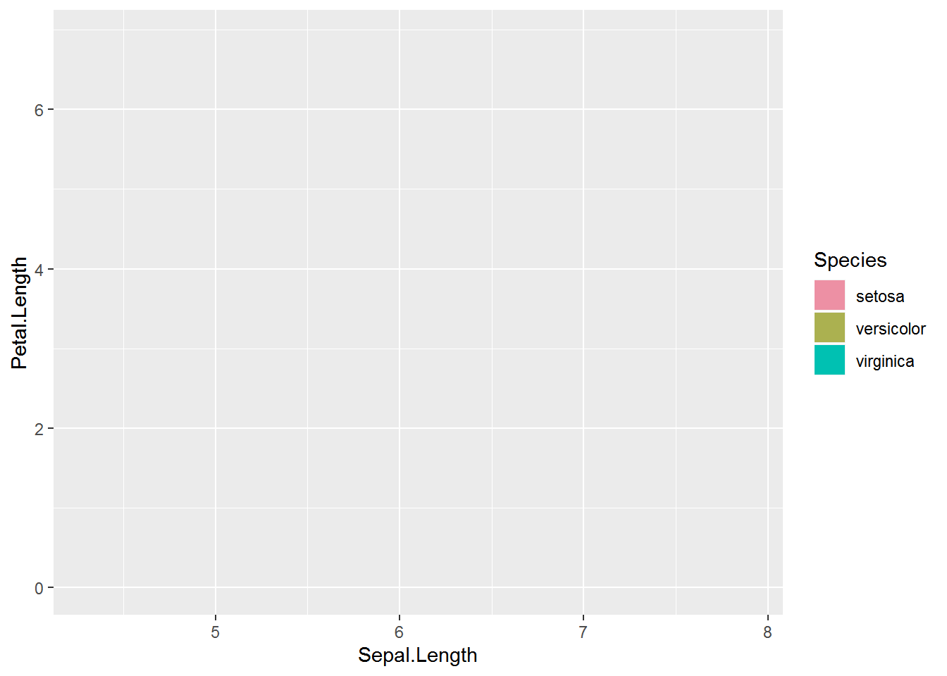
Embedding the bar plot subplots
Last step! I can now add the list of subplots in annotation_custom() to the larger plot. 🎉
There was a little extra space on the y axis that I removed by setting the axis limits.
I think this looks nice with evenly spaced subplots but there may be times that having unevenly spaced subplots is desirable. In that case you could cut the variables into uneven groups.
largeplot +
     allgrobs$grobs +
     ylim(1, NA)
# Warning: Removed 150 rows containing missing values (geom_col).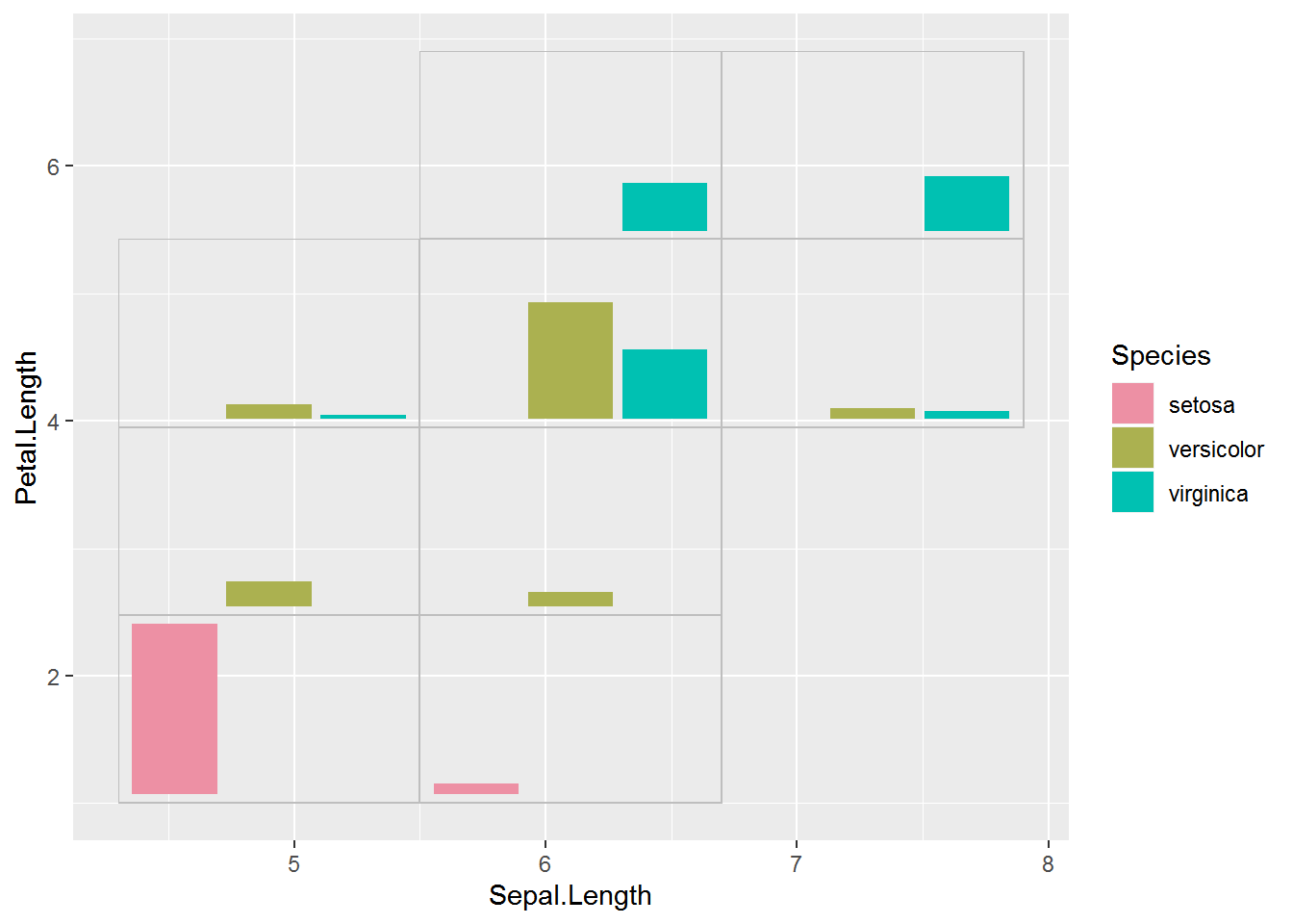
After polishing this plot up a bit as desired, the final plot can be saved with ggsave().
Histogram subplots
I’ve seen quite a few examples of embedded plots with bar plot or pie chart subplots to show patterns in the distribution of some categorical variable across the axis variables. But there’s no reason we can’t show the distribution of a third continuous variable.
I decided to make a histogram of the variable Petal.Width for the same subplot groups I used above. I found a lot of little details to work through when making subplots showing the distribution of a continuous variable.
I want the x axis of each plot to encompass the entire range of Petal.Width, so my first step was to pull out that information. These values will be the x axis limits (with some extra added to make sure all the histogram bars fit) and the limits for the continuous legend.
range(iris$Petal.Width)# [1] 0.1 2.5I found the y axis to be a little trickier. I decided to show the bars as proportions of the maximum count with ncount instead of as a raw count. Since the height of bars is then a proportion of maximum instead of a count I added the sample size per group to the plot as text. I ended up putting this in a facet strip rather than within the plot. I went back and forth a bunch and am still not sure the final result is exactly what I want.
I’ll base the color of the bars on Petal.Width. This can be done with fill = stat(x), which is how to refer to the bins calculated by geom_histogram().
To make sure each plot has the same number of bar I set the binwidth. I chose to make each bar 0.2 units wide, since the entire range of Petal.Width (2.4 units) is evenly divisible by that number. I also center the first bar at the minimum value of the dataset, so the first bar is centered at 0.1.
I pad the x axis limits with half the binwidth value to make sure all the bars will show in every plot. Getting the limits correct can be hard; see, e.g., this GitHub issue if you are seeing warnings that you don’t think are correct.
Here is my example plot for the first group. Since I was careful with my plot limits the warning message is spurious.
ggplot(data = filter(iris, max_x <= 5.5, max_y <= 2.475),
       aes(x = Petal.Width, y = stat(ncount), fill = stat(x) ) ) +
     geom_histogram(binwidth = .2, center = .1) +
     theme_void(base_size = 14) +
     scale_x_continuous(limits = c(0.1 - .1, 2.5 + .1) ) +
     scale_fill_continuous(type = "viridis",
                           guide  = "none",
                           limits = c(.1, 2.5) ) +
     facet_wrap(~paste0("n = ", nrow(filter(iris, max_x <= 5.5, max_y <= 2.475) ) ) ) +
     theme(panel.border = element_rect(color = "grey",
                                       fill = "transparent") )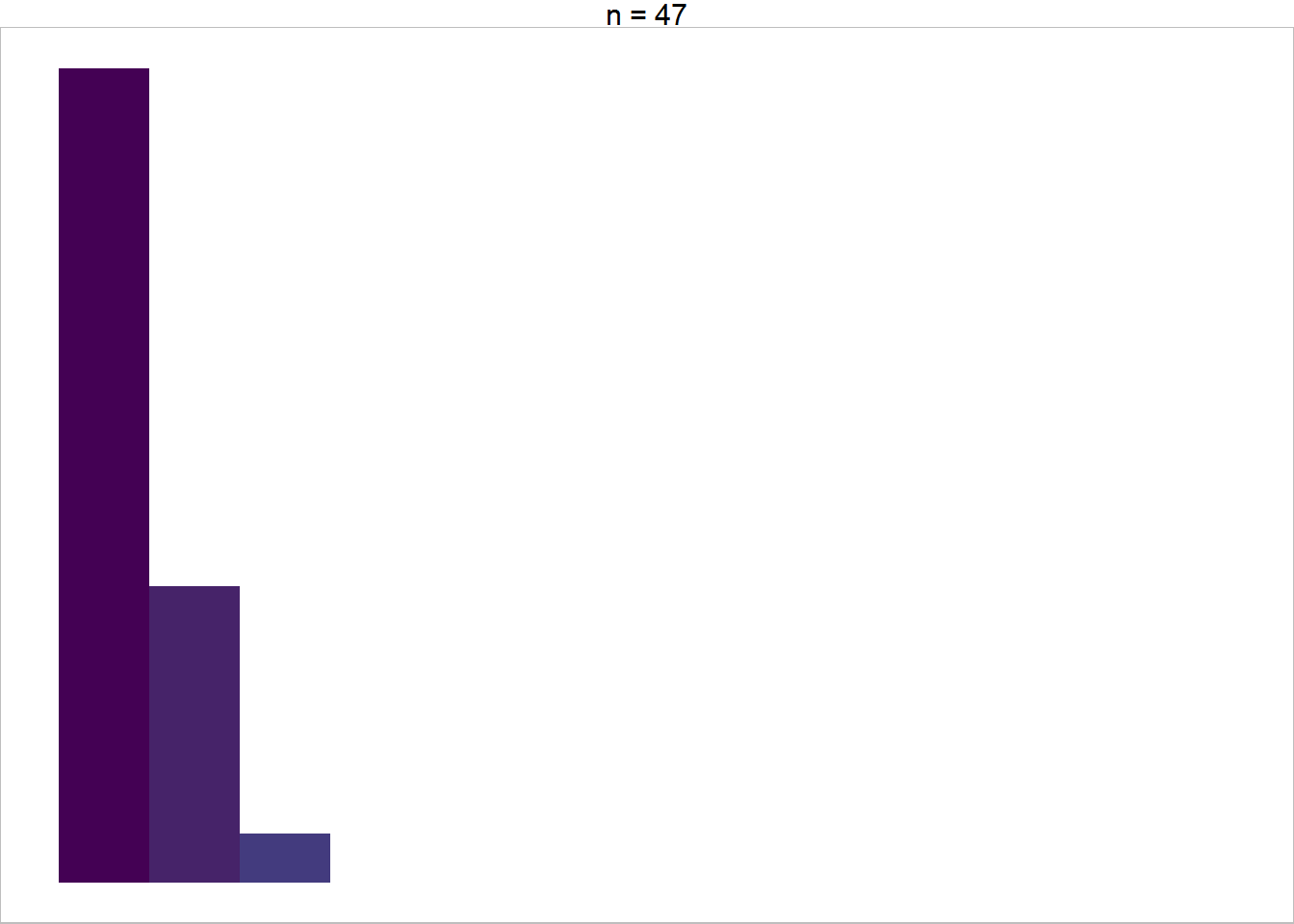
And here’s the function to make histograms for each subplot dataset, which I name histfun.
histfun = function(data) {
     ggplot(data = data,
            aes(x = Petal.Width, y = stat(ncount), fill = stat(x) ) ) +
          geom_histogram(binwidth = .2, center = .1) +
          theme_void(base_size = 14) +
          scale_x_continuous(limits = c(0.1 - .1, 2.5 + .1) ) +
          scale_fill_continuous(type = "viridis",
                                guide  = "none",
                                limits = c(.1, 2.5) ) +
          facet_wrap(~paste0("n = ", nrow(data) ) ) +
          theme(panel.border = element_rect(color = "grey",
                                            fill = "transparent") )
}
Get the histograms ready to embed
This time I’ll make the subplots with histfun and then put them into annotation_custom() with grobfun in one pipe chain.
allgrobs_hist = iris %>%
     group_by_at( vars( matches("min|max") ) ) %>%
     group_nest() %>%
     mutate(subplots = map(data, histfun) ) %>%
     select(-data) %>%
     mutate(grobs = pmap(., grobfun) )
Embed the histogram subplots
This time the large plot needs a continuous legend. I set the breaks so the minimum and maximum value are included on the legend. How well this works will depend on the range of your dataset.
( largeplot2 = ggplot(iris, aes(x = Sepal.Length,
                                y = Petal.Length,
                                fill = Petal.Width) ) +
       geom_blank() +
       geom_col( aes(Inf, Inf) ) +
       scale_fill_continuous(type = "viridis",
                             limits = c(.1, 2.5),
                             breaks = seq(.1, 2.5, by = .8) ) )
# Warning: Removed 149 rows containing missing values (geom_col).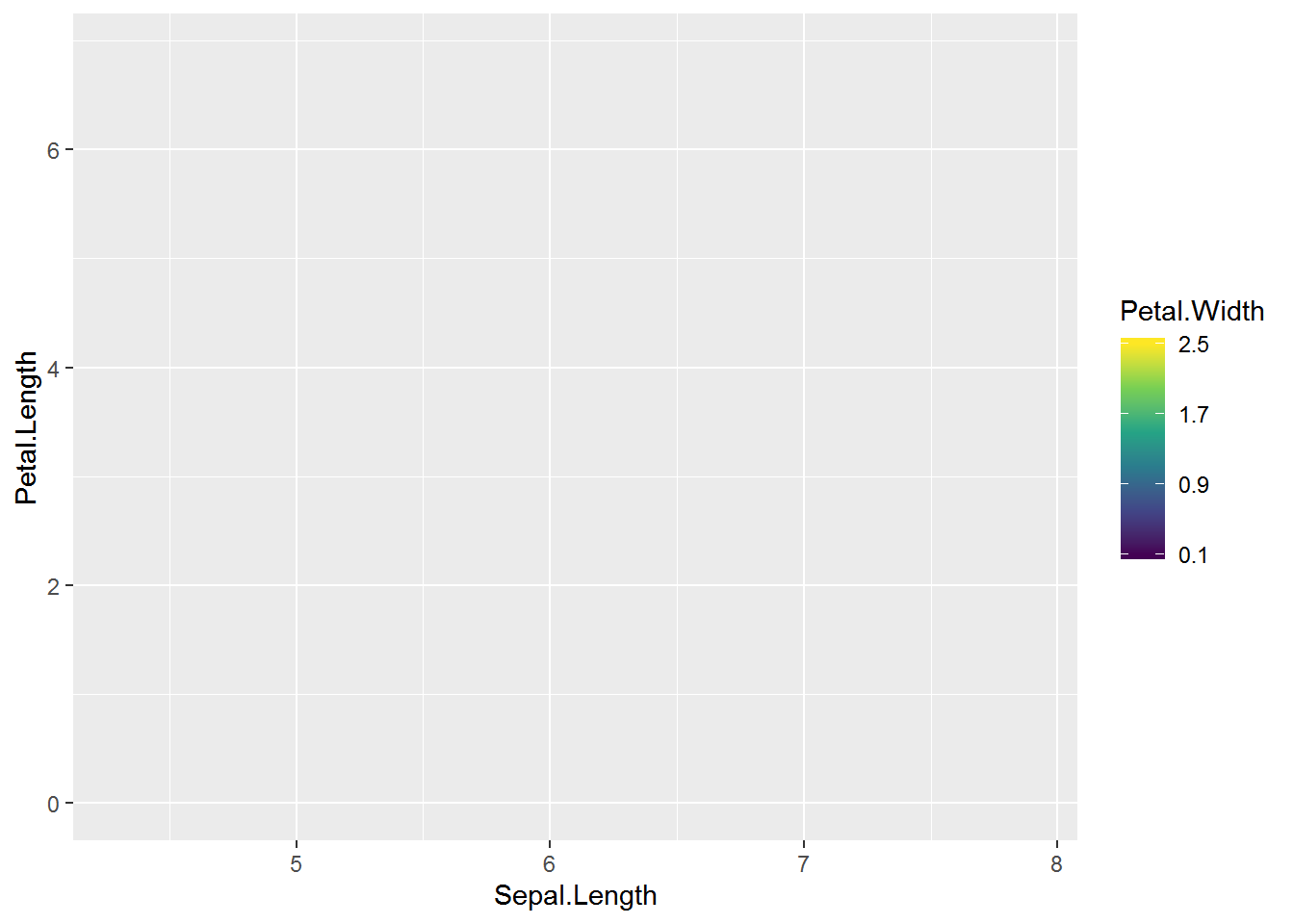
And, finally, here’s the plot embedded with the Petal.Width distribution plots. 😃
largeplot2 +
     allgrobs_hist$grobs +
     ylim(1, NA)
# Warning: Removed 150 rows containing missing values (geom_col).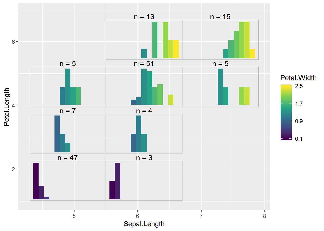
A density subplot example
I thought the histogram subplots ended up being pretty tricky, what with having to figure out the plot limits and the bar widths and centers.
Density plots are another possibility for showing the distribution of continuous data, and the color of the line can be allowed to vary.
Here’s an example of what a density plot could look like. In some scenarios using trim = TRUE may be useful in stat_density(). You’ll notice I set the x axis limits to the minimum and maximum value in the datast with no padding for this plot.
ggplot(data = filter(iris, max_x <= 5.5, max_y <= 2.475),
       aes(x = Petal.Width, y = stat(ndensity), color = stat(x) ) ) +
     stat_density(geom = "line", size = 1.25) +
     theme_void(base_size = 14) +
     scale_x_continuous(limits = c(0.1, 2.5),
                        expand = c(0, 0) ) +
     scale_color_viridis_c(guide  = "none",
                           limits = c(.1, 2.5) ) +
     facet_wrap(~paste0("n = ", nrow(filter(iris, max_x <= 5.5, max_y <= 2.475) ) ) ) +
     theme(panel.border = element_rect(color = "grey",
                                       fill = "transparent") )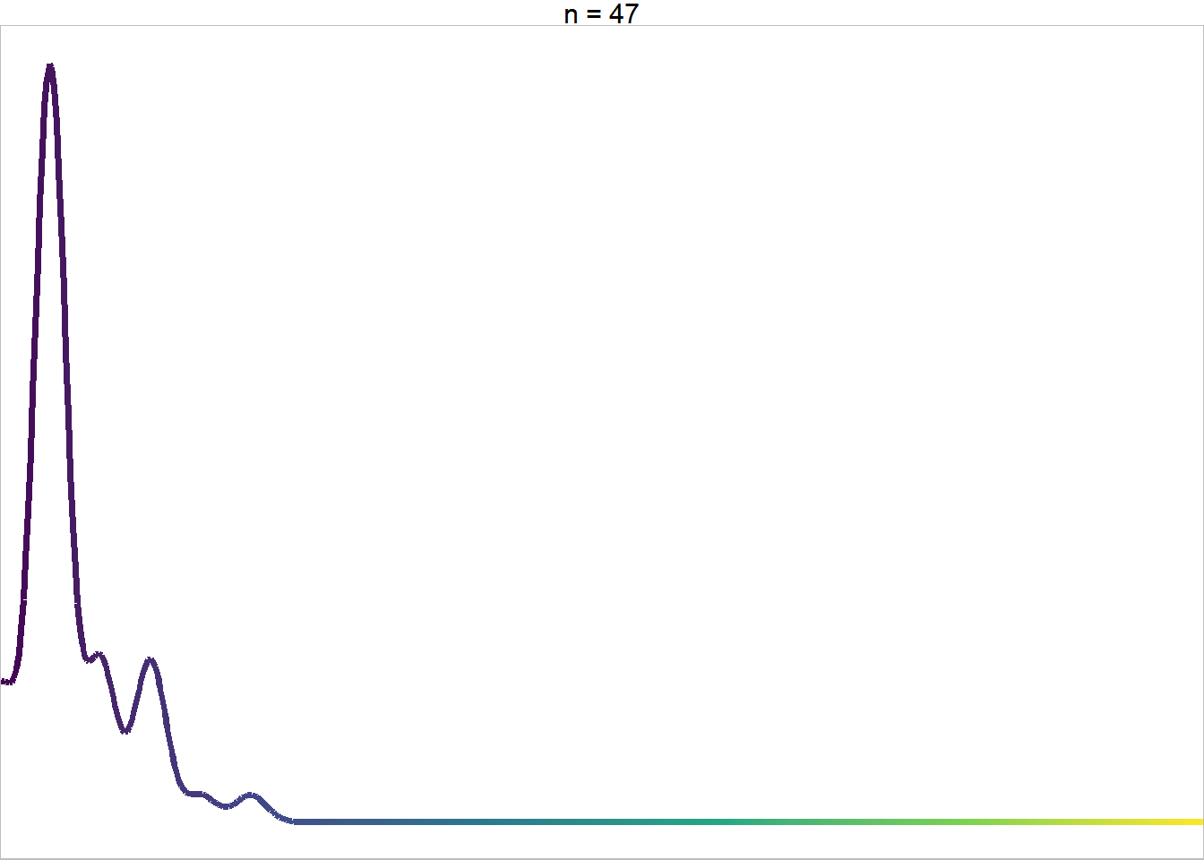
Turning the plot code into a function for looping through groups.
densfun = function(data) {
     ggplot(data = data,
            aes(x = Petal.Width, y = stat(ndensity), color = stat(x) ) ) +
          stat_density(geom = "line", size = 1.25) +
          theme_void(base_size = 14) +
          scale_x_continuous(limits = c(0.1, 2.5),
                             expand = c(0, 0) ) +
          scale_color_viridis_c(guide  = "none",
                                limits = c(.1, 2.5) ) +
          facet_wrap(~paste0("n = ", nrow(data) ) ) +
          theme(panel.border = element_rect(color = "grey",
                                            fill = "transparent") )
}
Loop through to create and get the subplots ready to add to the plot.
allgrobs_dens = iris %>%
     group_by_at( vars( matches("min|max") ) ) %>%
     group_nest() %>%
     mutate(subplots = map(data, densfun) ) %>%
     select(-data) %>%
     mutate(grobs = pmap(., grobfun) )
And here’s the density subplots embedded in the large plot. Not too bad! I’m guessing the density plot approach would be most useful for larger sample sizes. 😺
largeplot2 +
     allgrobs_dens$grobs +
     ylim(1, NA)
# Warning: Removed 150 rows containing missing values (geom_col).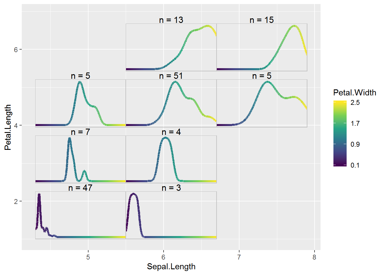
Filled density plots
I belatedly realized that we can use geom_density_ridges_gradient() from package ggridges to make density plots with continuous fill.
Since this package is really for ridge plots, I use y = 1 to get a single density plot. This geom uses a relative scale by default so stat(ndensity) isn’t needed.
library(ggridges) # v 0.5.1
ggplot(data = filter(iris, max_x <= 5.5, max_y <= 2.475),
       aes(x = Petal.Width, y = 1, fill = stat(x) ) ) +
     geom_density_ridges_gradient() +
     theme_void(base_size = 14) +
     scale_x_continuous(limits = c(0.1, 2.5),
                        expand = c(0, 0) ) +
     scale_fill_viridis_c(guide  = "none",
                           limits = c(.1, 2.5) ) +
     facet_wrap(~paste0("n = ", nrow(filter(iris, max_x <= 5.5, max_y <= 2.475) ) ) ) +
     theme(panel.border = element_rect(color = "grey",
                                       fill = "transparent") )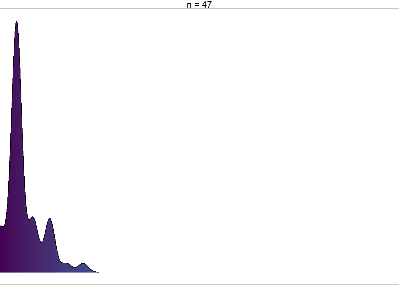
Let’s see how that looks as embedded plots. I’ll do the whole process in one code chunk, taking some extra time to move the legend around in the final plot.
densfun2 = function(data) {
  ggplot(data = data,
         aes(x = Petal.Width, y = 1, fill = stat(x) ) ) +
    geom_density_ridges_gradient() +
    theme_void(base_size = 14) +
    scale_x_continuous(limits = c(0.1, 2.5),
                       expand = c(0, 0) ) +
    scale_fill_viridis_c(guide  = "none",
                         limits = c(.1, 2.5) ) +
    facet_wrap(~paste0("n = ", nrow(data) ) ) +
    theme(panel.border = element_rect(color = "grey",
                                      fill = "transparent") )
}
allgrobs_dens2 = iris %>%
    group_by_at( vars( matches("min|max") ) ) %>%
    group_nest() %>%
    mutate(subplots = map(data, densfun2) ) %>%
    select(-data) %>%
    mutate(grobs = pmap(., grobfun) )

largeplot2 +
    allgrobs_dens2$grobs +
    ylim(1, NA) +
    theme_bw() +
    theme(legend.direction = "horizontal",
          legend.position = c(.8, .25),
          legend.background = element_blank() ) +
    guides(fill = guide_colorbar(title.position = "top") )
# Warning: Removed 150 rows containing missing values (geom_col).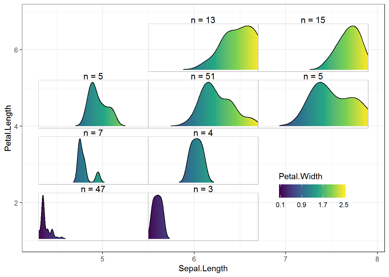
Just the code, please
Here’s the code without all the discussion. Copy and paste the code below or you can download an R script of uncommented code from here.
library(ggplot2) # 3.1.1
suppressPackageStartupMessages( library(dplyr) ) # 0.8.0.1
library(tidyr) # 0.8.3
library(purrr) # 0.3.2

cuteven = function(variable, ngroups) {
     seq_all = seq(min(variable), max(variable), length.out = ngroups + 1)
     cut(variable,
         breaks = seq_all,
         labels = paste(seq_all[-(ngroups + 1)], seq_all[-1], sep = ","),
         include.lowest = TRUE)
}

with(iris, cuteven(Sepal.Length, ngroups = 3) )

iris = mutate(iris,
                group_x = cuteven(Sepal.Length, 3),
                group_y = cuteven(Petal.Length, 4) )

glimpse(iris)

iris = iris %>%
     separate(group_x, into = c("min_x", "max_x"),
              sep = ",", convert = TRUE) %>%
     separate(group_y, into = c("min_y", "max_y"),
              sep = ",", convert = TRUE)

glimpse(iris)

iris %>%
     group_by(min_x, max_x, min_y, max_y, Species) %>%
     count() %>%
     ungroup() %>%
     filter(n == max(n) )

ggplot(data = filter(iris, max_x <= 5.5, max_y <= 2.475),
       aes(x = Species, fill = Species) ) +
     geom_bar() +
     theme_void() +
     scale_x_discrete(limits = c("setosa", "versicolor", "virginica") ) +
     scale_fill_manual(values = c("setosa" = "#ED90A4",
                                  "versicolor" = "#ABB150",
                                  "virginica" = "#00C1B2"),
                       guide  = "none") +
     theme(panel.border = element_rect(color = "grey",
                                       fill = "transparent") ) +
     ylim(0, 47)

barfun = function(data) {
     ggplot(data = data,
            aes(x = Species, fill = Species) ) +
          geom_bar() +
          theme_void() +
          scale_x_discrete(limits = c("setosa", "versicolor", "virginica") ) +
          scale_fill_manual(values = c("setosa" = "#ED90A4",
                                       "versicolor" = "#ABB150",
                                       "virginica" = "#00C1B2"),
                            guide  = "none") +
          theme(panel.border = element_rect(color = "grey",
                                            fill = "transparent") ) +
          ylim(0, 47)

}
barfun(data = filter(iris, max_x <= 5.5, max_y <= 2.475) )

allplots = iris %>%
     group_by_at( vars( matches("min|max") ) ) %>%
     group_nest() %>%
     mutate(subplots = map(data, barfun) )

allplots
allplots$subplots[[1]]
allplots$subplots[[6]]
grobfun = function(min_x, max_x, min_y, max_y, subplots) {
     annotation_custom(ggplotGrob(subplots),
                       xmin = min_x, ymin = min_y,
                       xmax = max_x, ymax = max_y)
}

( allgrobs = allplots %>%
     select(-data) %>%
     mutate(grobs = pmap(., grobfun) ) )

( largeplot = ggplot(iris, aes(x = Sepal.Length,
                               y = Petal.Length,
                               fill = Species) ) +
       geom_blank() +
       geom_col( aes(Inf, Inf) ) +
       scale_fill_manual(values = c("setosa" = "#ED90A4",
                                    "versicolor" = "#ABB150",
                                    "virginica" = "#00C1B2") ) )

largeplot +
     allgrobs$grobs +
     ylim(1, NA)

range(iris$Petal.Width)

ggplot(data = filter(iris, max_x <= 5.5, max_y <= 2.475),
       aes(x = Petal.Width, y = stat(ncount), fill = stat(x) ) ) +
     geom_histogram(binwidth = .2, center = .1) +
     theme_void(base_size = 14) +
     scale_x_continuous(limits = c(0.1 - .1, 2.5 + .1) ) +
     scale_fill_continuous(type = "viridis",
                           guide  = "none",
                           limits = c(.1, 2.5) ) +
     facet_wrap(~paste0("n = ", nrow(filter(iris, max_x <= 5.5, max_y <= 2.475) ) ) ) +
     theme(panel.border = element_rect(color = "grey",
                                       fill = "transparent") )

histfun = function(data) {
     ggplot(data = data,
            aes(x = Petal.Width, y = stat(ncount), fill = stat(x) ) ) +
          geom_histogram(binwidth = .2, center = .1) +
          theme_void(base_size = 14) +
          scale_x_continuous(limits = c(0.1 - .1, 2.5 + .1) ) +
          scale_fill_continuous(type = "viridis",
                                guide  = "none",
                                limits = c(.1, 2.5) ) +
          facet_wrap(~paste0("n = ", nrow(data) ) ) +
          theme(panel.border = element_rect(color = "grey",
                                            fill = "transparent") )
}

allgrobs_hist = iris %>%
     group_by_at( vars( matches("min|max") ) ) %>%
     group_nest() %>%
     mutate(subplots = map(data, histfun) ) %>%
     select(-data) %>%
     mutate(grobs = pmap(., grobfun) )

( largeplot2 = ggplot(iris, aes(x = Sepal.Length,
                                y = Petal.Length,
                                fill = Petal.Width) ) +
       geom_blank() +
       geom_col( aes(Inf, Inf) ) +
       scale_fill_continuous(type = "viridis",
                             limits = c(.1, 2.5),
                             breaks = seq(.1, 2.5, by = .8) ) )

largeplot2 +
     allgrobs_hist$grobs +
     ylim(1, NA)

ggplot(data = filter(iris, max_x <= 5.5, max_y <= 2.475),
       aes(x = Petal.Width, y = stat(ndensity), color = stat(x) ) ) +
     stat_density(geom = "line", size = 1.25) +
     theme_void(base_size = 14) +
     scale_x_continuous(limits = c(0.1, 2.5),
                        expand = c(0, 0) ) +
     scale_color_viridis_c(guide  = "none",
                           limits = c(.1, 2.5) ) +
     facet_wrap(~paste0("n = ", nrow(filter(iris, max_x <= 5.5, max_y <= 2.475) ) ) ) +
     theme(panel.border = element_rect(color = "grey",
                                       fill = "transparent") )

densfun = function(data) {
     ggplot(data = data,
            aes(x = Petal.Width, y = stat(ndensity), color = stat(x) ) ) +
          stat_density(geom = "line", size = 1.25) +
          theme_void(base_size = 14) +
          scale_x_continuous(limits = c(0.1, 2.5),
                             expand = c(0, 0) ) +
          scale_color_viridis_c(guide  = "none",
                                limits = c(.1, 2.5) ) +
          facet_wrap(~paste0("n = ", nrow(data) ) ) +
          theme(panel.border = element_rect(color = "grey",
                                            fill = "transparent") )
}

allgrobs_dens = iris %>%
     group_by_at( vars( matches("min|max") ) ) %>%
     group_nest() %>%
     mutate(subplots = map(data, densfun) ) %>%
     select(-data) %>%
     mutate(grobs = pmap(., grobfun) )
largeplot2 +
     allgrobs_dens$grobs +
     ylim(1, NA)

library(ggridges) # v 0.5.1
ggplot(data = filter(iris, max_x <= 5.5, max_y <= 2.475),
       aes(x = Petal.Width, y = 1, fill = stat(x) ) ) +
     geom_density_ridges_gradient() +
     theme_void(base_size = 14) +
     scale_x_continuous(limits = c(0.1, 2.5),
                        expand = c(0, 0) ) +
     scale_fill_viridis_c(guide  = "none",
                           limits = c(.1, 2.5) ) +
     facet_wrap(~paste0("n = ", nrow(filter(iris, max_x <= 5.5, max_y <= 2.475) ) ) ) +
     theme(panel.border = element_rect(color = "grey",
                                       fill = "transparent") )

densfun2 = function(data) {
  ggplot(data = data,
         aes(x = Petal.Width, y = 1, fill = stat(x) ) ) +
    geom_density_ridges_gradient() +
    theme_void(base_size = 14) +
    scale_x_continuous(limits = c(0.1, 2.5),
                       expand = c(0, 0) ) +
    scale_fill_viridis_c(guide  = "none",
                         limits = c(.1, 2.5) ) +
    facet_wrap(~paste0("n = ", nrow(data) ) ) +
    theme(panel.border = element_rect(color = "grey",
                                      fill = "transparent") )
}
allgrobs_dens2 = iris %>%
    group_by_at( vars( matches("min|max") ) ) %>%
    group_nest() %>%
    mutate(subplots = map(data, densfun2) ) %>%
    select(-data) %>%
    mutate(grobs = pmap(., grobfun) )

largeplot2 +
    allgrobs_dens2$grobs +
    ylim(1, NA) +
    theme_bw() +
    theme(legend.direction = "horizontal",
          legend.position = c(.8, .25),
          legend.background = element_blank() ) +
    guides(fill = guide_colorbar(title.position = "top") )