Simulate! Simulate! - Part 3: The Poisson edition
One of the things I like about simulations is that, with practice, they can be a quick way to check your intuition about a model or relationship.
My most recent example is based on a discussion with a student about quadratic effects.
I’ve never had a great grasp on what the coefficients that define a quadratic relationship mean. Luckily there is this very nice FAQ page from the Institute for Digital Research and Education at UCLA that goes over the meaning of the coefficients in detail, with examples. This has become my go-to page when I need a review (which is apparently every time the topic comes up 😜).
So while we understood what the quadratic effect “meant” in the model, in this particular case the student was working with a generalized linear mixed model for count data. This model was linear on the log scale. If something is quadratic on the log scale (the scale of the model), what does the relationship look like on the original scale (the scale of the data)?
I wasn’t sure. Logically I would say that if something that is a straight line on the log scale is curved on the data scale then something that is curved on the log scale should be more curved on the original scale. Right? But how much more curved? Hmm.
Simulation to the rescue! I decided to simulate some data to see what a relationship like the one the student had estimated could look like on the original scale.
Table of Contents
The statistical model
Even though what I did was a single iteration simulation, I think it is still useful to write out the statistical model I used for building the simulated data. It has been the combination of seeing the equations and then doing simulations (and then seeing the equations in a new light 😁) that has really helped me understand generalized linear (mixed) models and so I like to include the models explicitly in these posts. But if you’re at a place where you find looking at these equations makes your eyes glaze over, jump down to the code.
The statistical model for generalized linear model looks pretty different than the statistical model of the very special case when we assume normality. Since so many of us (like me!) learned that special case first, this different approach takes some getting used to.
Instead of defining the distribution of the errors we’ll now directly define the distribution of the response variable. (For a more formal coverage of the statistical model for generalized linear (mixed) models see Stroup’s Rethinking the Analysis of Non-Normal Data in Plant and Soil Science.)
I’m going to use a Poisson generalized linear model for my simulation, so the response variable will be discrete counts. In my statistical model I first define a response variable that comes from the Poisson distribution.
\[y_t \thicksim Poisson(\lambda_t)\]
- \(y_t\) is the recorded count for the \(t\)th observation of the discrete response variable.
- \(\lambda_t\) is the unobserved true mean of the Poisson distribution for the \(t\)th observation. The Poisson distribution is a single parameter distribution, where the variance is exactly equal the mean.
We will assume that the relationship between the mean of the response and any explanatory variables is linear on the log scale. This can be described as using a log link, since the log is the function that “links” the mean to the linear predictor. If you’re coming from the world of linear models you may be used to describing the relationship between the response variable and any explanatory variables, not the relationship between the mean of the response variable and explanatory variables.
The model I define here is a quadratic model for a single, continuous explanatory variable.
\[log(\lambda_t) = \beta_0 + \beta_1*x_t + \beta_2*x^2_t\]
- \(x_t\) is the recorded value of the \(t\)th observation of the continuous explanatory variable.
- \(x^2_t\) is the square of \(x_t\).
- \(\beta_0\), \(\beta_1\), and \(\beta_2\) are parameters (intercepts and slope coefficients) of the linear model.
If you are new to generalized linear models you might want to take a moment and note of the absence of epsilon in the linear predictor.
Notice we can calculate the mean on the original scale instead of the log scale by exponentiating both sides of the above equation. This will be important when we get to writing code to simulate data.
\[\lambda_t = exp(\beta_0 + \beta_1*x_t + \beta_2*x^2_t)\]
Code for a single simulation
The first thing I will do in this simulation is define my true parameter values. I’m simulating a relationship between x and y that is similar to the student’s results so I’ll set the intercept and the linear coefficient (\(\beta_0\) and \(\beta_1\), respectively) both to 0.5 and the quadratic coefficient (\(\beta_2\)) to 5.
b0 = .5
b1 = .5
b2 = 5
Next I need an explanatory variable, which I’ll call x. I decided to make this a continuous variable between 0 and 1 by taking 100 random draws from a uniform distribution with a minimum of 0 and a maximum of 1 via runif(). Since I’m taking 100 draws, \(t\) in the statistical model goes from 1-100.
I’ll set my seed prior to generating random numbers so you’ll get identical results if you run this code.
set.seed(16)
x = runif(100, min = 0, max = 1)
head(x) # First six values of x
# [1] 0.6831101 0.2441174 0.4501114 0.2294351 0.8635079 0.3112003Once I have my parameters set and an explanatory variable created I can calculate \(\lambda_t\). This is where I find the statistical model to be really handy, as it directly shows me how to write the code. Because I want to calculate the means on the original scale and not the log of the means I use the model equation after exponentiating both sides.
I’ll simulate the 100 means via
\[\lambda_t = exp(0.5 + 0.5*x_t + 5*x^2_t)\]
lambda = exp(b0 + b1*x + b2*x^2)The step above simulates the mean of each value of the response variable. These values are continuous, not discrete counts.
head(lambda)# [1] 23.920881 2.509354 5.686283 2.405890 105.634346 3.126231Now that I have a vector of means I can use it to generate a count for each value of lambda based on the Poisson distribution. I do this via rpois().
The next bit of code is based on the distribution defined in the statistical model. Remember that we defined y as:
\[y_t \thicksim Poisson(\lambda_t)\]
It is this step where we add “Poisson errors” to the mean to generate the response variable. For a fixed x variable, the variation for each simulated y value around the mean is based on the Poisson variance. For linear model simulations we usually add variability to the mean by simulating the errors directly from a normal distribution with a mean of 0. Since the variance is based on the mean in the Poisson distribution, adding the variability isn’t so obvious. I’ve seen this referred to as adding “Poisson noise”, but “Poisson errors” may be a better term.
I randomly draw 100 counts, one for each of the 100 means stored in lambda.
y = rpois(100, lambda = lambda) Unlike lambda, the y variable is a discrete count. This is the response variable that will be used in analysis.
head(y)# [1] 25 4 5 4 114 2Results!
Now that I have simulated values for both the response and explanatory variable I can take a look at the relationship between x and y.
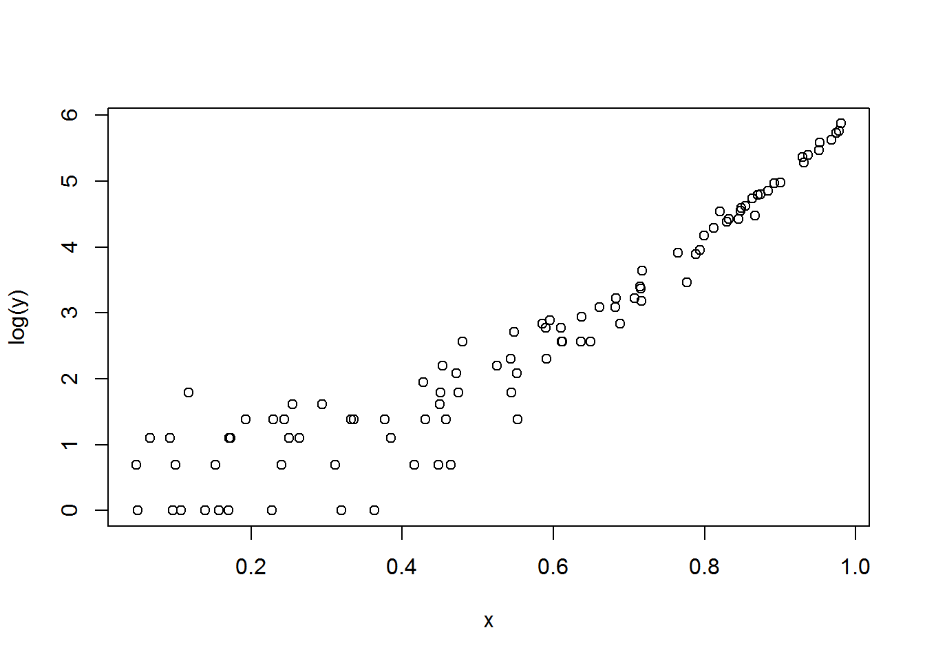
Below is what things look like on the log scale (the scale of the model). I was interested to see that, while the relationship was curved up as expected by the quadratic coefficient I used, the curve was really quite shallow.
plot(x, log(y) )
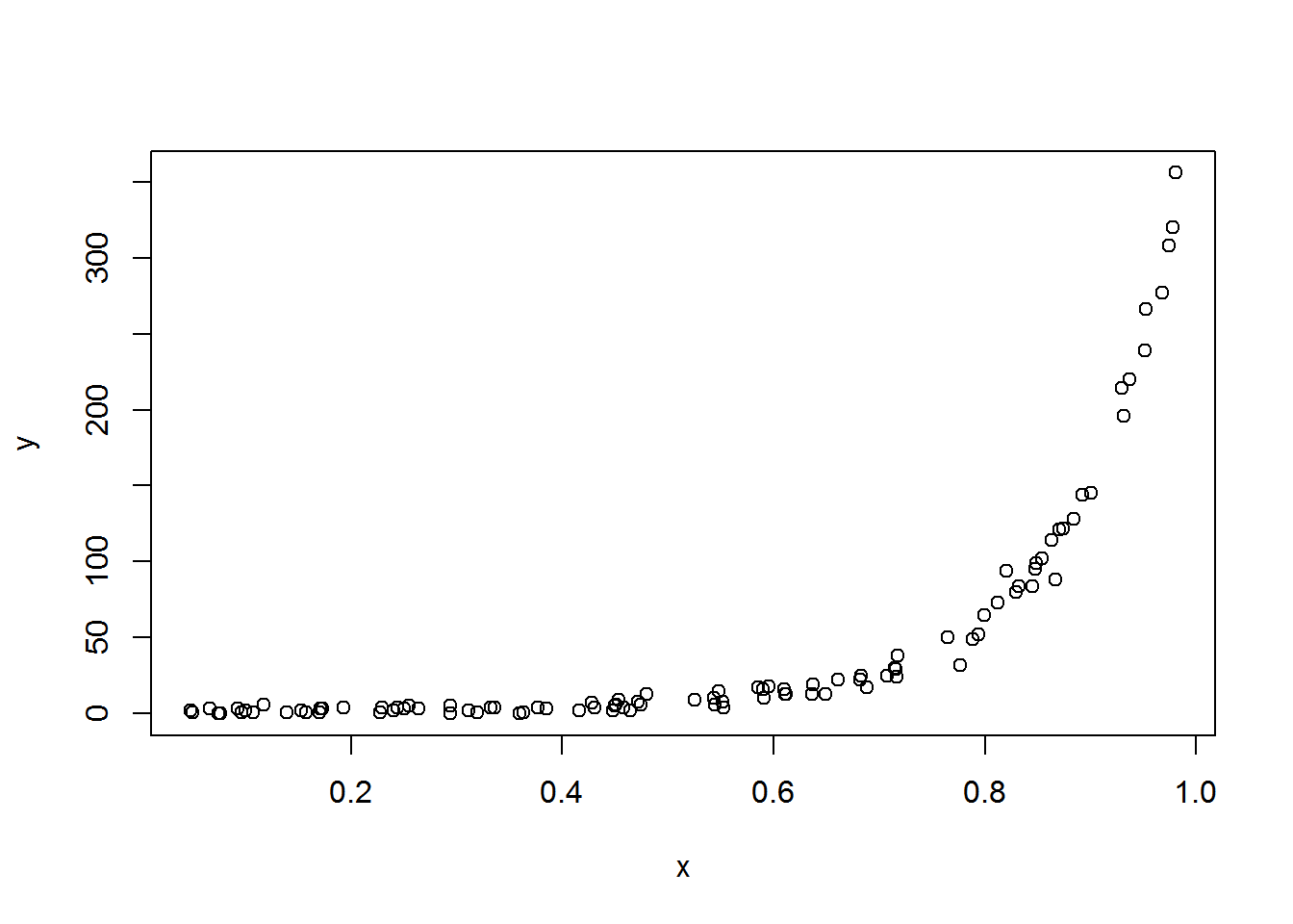
How do things look on the original scale? The curve is more extreme, much more than I realized it would be.
plot(x, y)
This was good to see, as it matched pretty well with an added variable plot the student had made. We had originally been concerned that there was some mistake in the plotting code, and being able to explore things via simulation helped allay these fears. Simulation success! 🥂
Just the code, please
Here’s the code without all the discussion. Copy and paste the code below or you can download an R script of uncommented code from here.
b0 = .5
b1 = .5
b2 = 5

set.seed(16)
x = runif(100, min = 0, max = 1)
head(x) # First six values of x

lambda = exp(b0 + b1*x + b2*x^2)
head(lambda)

y = rpois(100, lambda = lambda)
head(y)

plot(x, log(y) )

plot(x, y)